Michael Kluckner
 |
2025: I've reposted the images from this trip as larger
files – the original jpegs I put up in 2004 were small and
overexposed, befitting a time when many people's connections were
still dial-up and I had a lousy scanner. Most are very unfinished
sketches without any underpainting, which I would have done if I
could have dampened the paper – difficult to do outdoors, on the
street, under the Italian sun! And I was doing quite a lot of teaching in 2004, which explains the addition of the technical stuff below. Written in October, 2004 I determined to carry only the lightest, most portable art materials. Thus, a Cotman watercolour box, a single Isabey squirrel-mop travel brush, pencils, an eraser, my handmade 10 x 11 inch (1/6th of an imperial sheet) sketchbook of Arches140# cold-pressed paper, and the Moleskine sketchbook. We had absolutely limited amounts of luggage (only carry-on) as we were determined to be mobile and unencumbered, travelling without a car and moving around on foot, by train and by bus. On previous trips, I've painted cropped, intimate scenes that are like snapshots. This time I tried to pull back and record long views, such as the one of Firenze. These are the sorts of images that a camera mostly fails at, as cameras distort space, exaggerate the foreground and flatten the background to such an extent that the sense of a real 3-dimensional vista is usually lost. With a painting, even a small one, you can lay out the landscape on the paper the way your mind's eye sees it. I ran into the problem of always painting on dry paper. This, not surprisingly, is an occupational hazard of painting outdoors in crowded cities on hot,windy days. Nevertheless, the early pictures, especially the Roman ones, really miss the ambient light. I ended up trying to wet the paper with a tiny sponge, which was very messy and inadequate. Next time, definitely, I would make room in the bag for a small spray bottle. Otherwise, the kit worked well, and I would drag it around again, modifying the sketchbook slightly to 8 or 9 x 11 inches so that it wasn't quite so heavy to carry – it was about 3 pounds for 96 pages and a cover. Realistically, a book of about 32 sheets/64 pages would be more than enough for a trip of a month or so. |
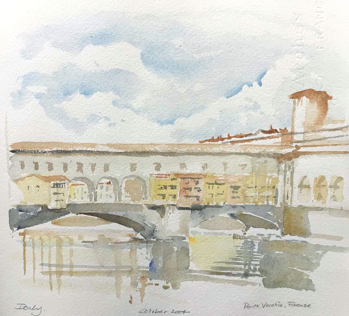
| The Ponte Vecchio in Firenze (Florence). Within sortie distance
of the swarms of pickpockets who hang around the bridge, therefore
I put everything from my pants pockets into my shirt pocket and
stood against the wall above the Arno River with the book and
paints on the railing. |
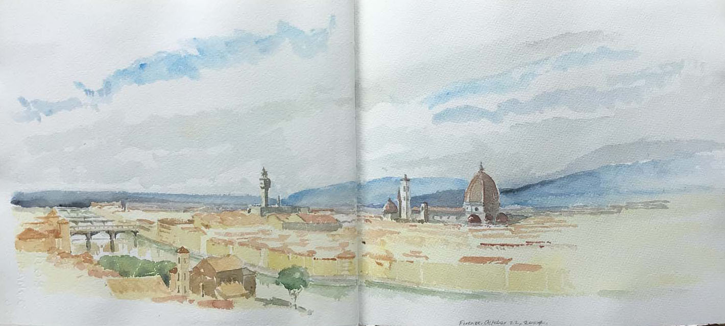
| Went back into Firenze/Florence on the final day from Cortona
(below) to try to capture a sense of that beautiful city. I found
a viewpoint on the far side of the river that was missed by most
of the city's sightseers and tranquil enough to spend an hour. |
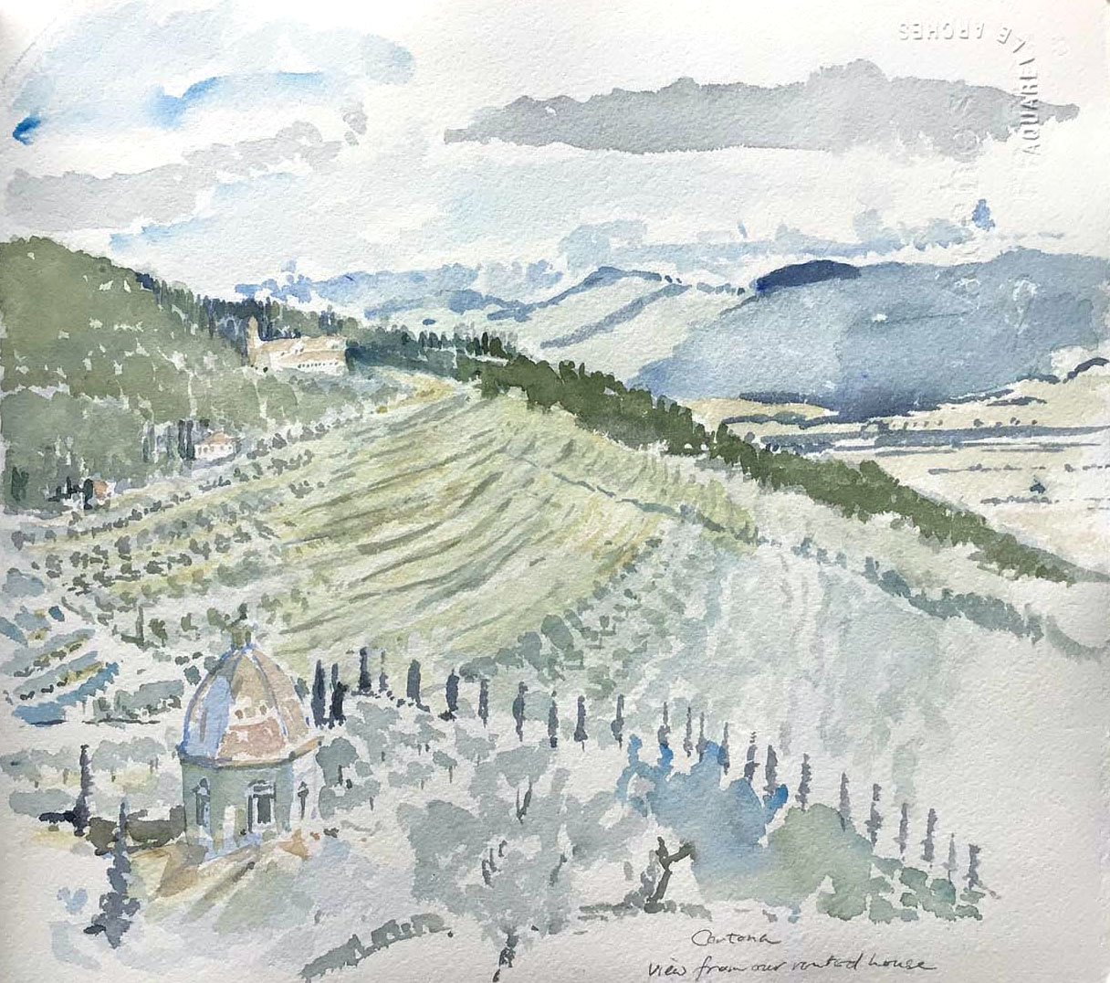
| The hillside below Cortona, from the side of the road a hundred
metres from our rented villa. I didn't fill in all the terracing
and olive trees that completely occupy the hillside. |
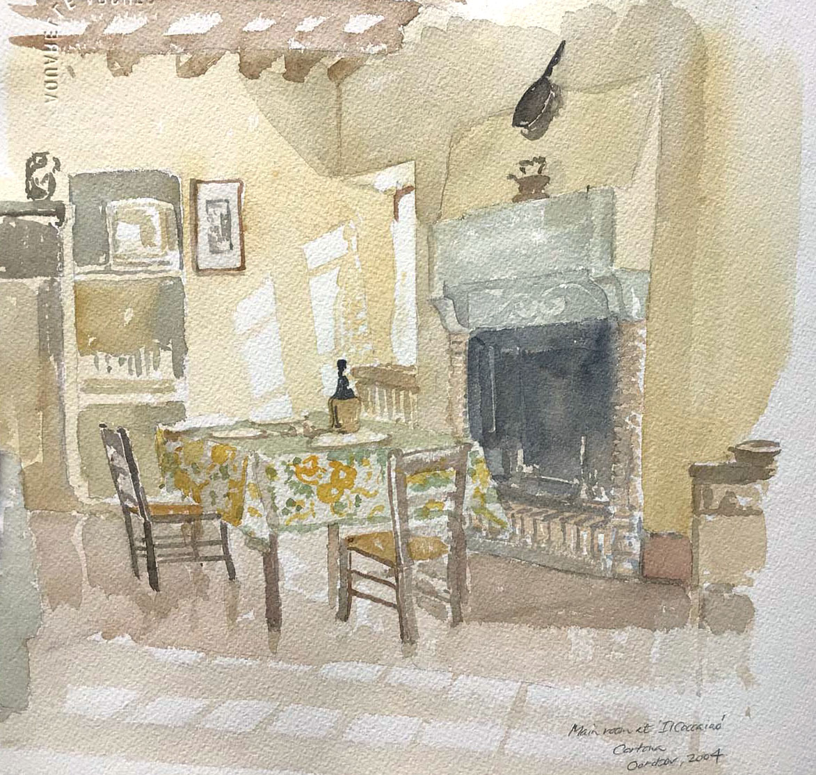
| The dining room at Cocciaio, our rented villa. I should have
underpainted it completely, leaving only the patches of sunlight
on the wall and floor "reserved" as white paper. That would have
strengthened the colours. The scene is too light and bright for
what was in reality a rather dark Cinquecento farmhouse interior. |
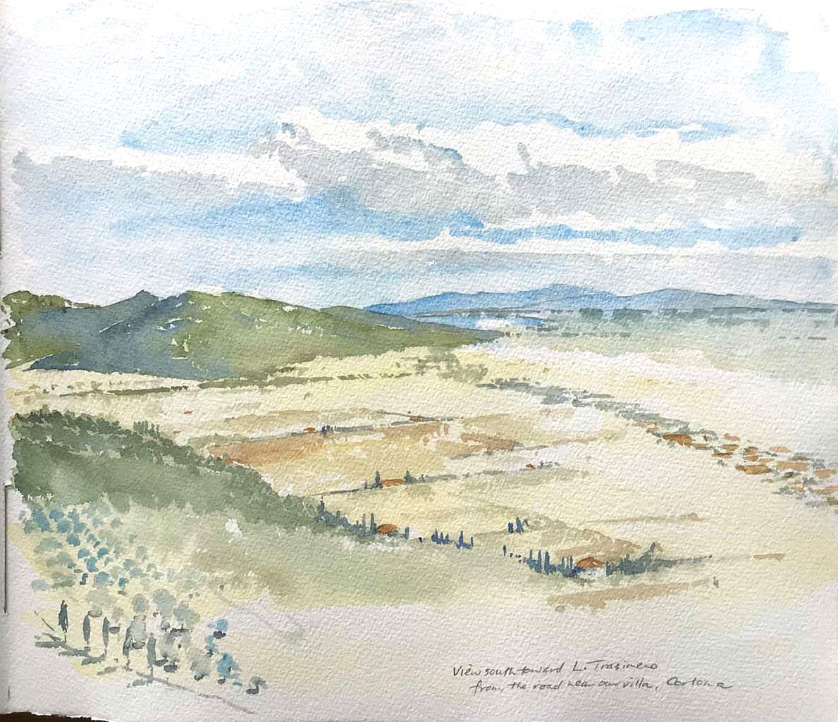
| The view from the Cortona villa looking along the valley south
to Lake Trasimeno. The straggle of buildings in the distance
follow the railway line from Camucia to Chiusi. |
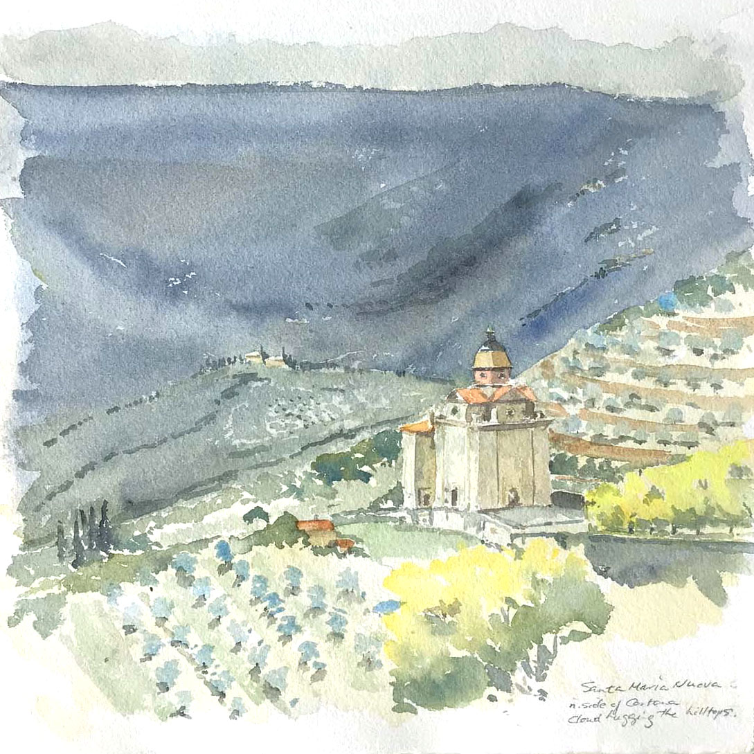
| Santa Maria Nuova on the north side of Cortona. I was able to
wet the paper and underpaint,giving a much richer and stronger
texture to the details applied later with relatively dry brush.
These ones from Cortona have much better, more authentic light to
them than the ones from Rome (below) where I was more besieged by
traffic and other tourists. |
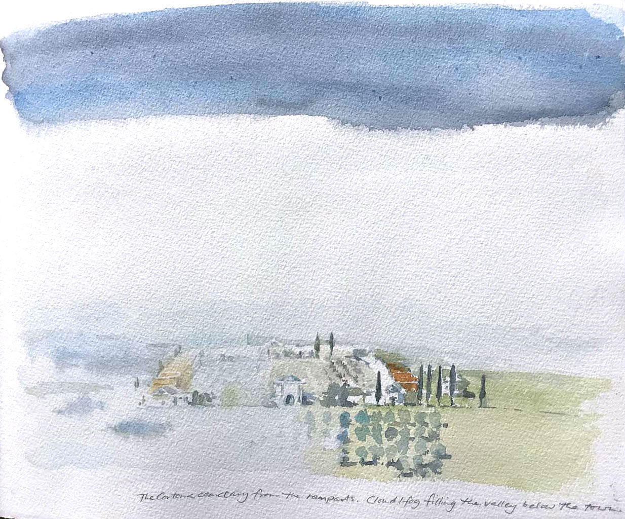
| Some mornings in Cortona the clouds flooded into thevalley on
the north side of the town (the triste, gloomy side
according to the locals, where Frances Mayes bought her "Under the
Tuscan Sun" villa). The cemetery occupies a bank below the town
wall, the land falling away steeply behind it into the valley. The
far hillside, dark blue in the morning light, was visible above
the cloud bank. |
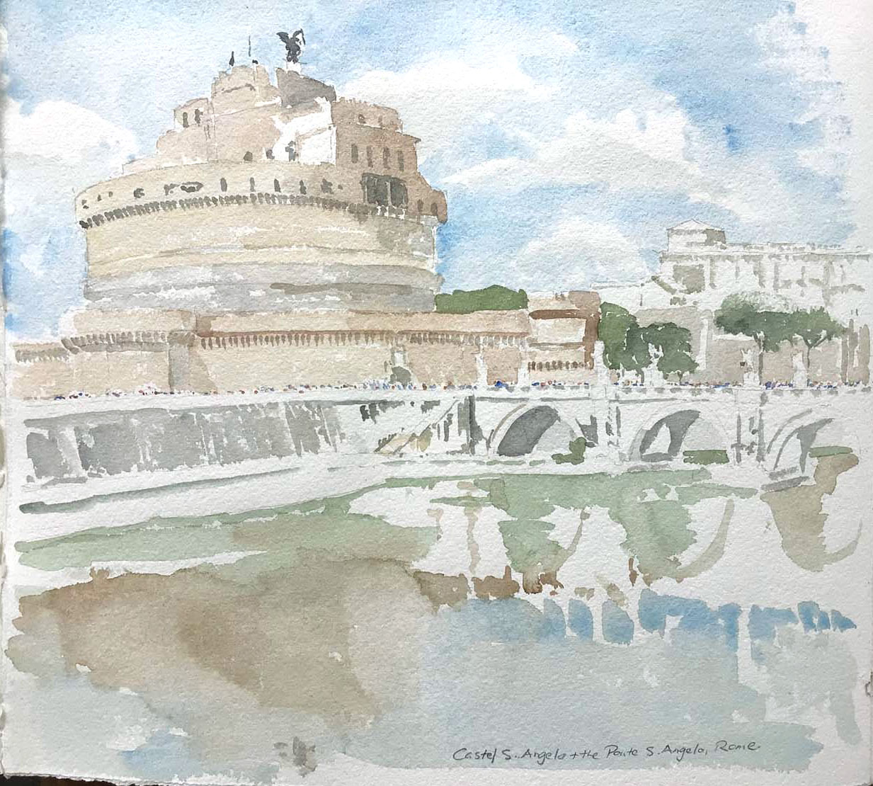
| Rome, the Castel S. Angelo and the Ponte S. Angelo crossing the
Tiber. The buildings of the Vatican are just out of sight to the
left. I've noted the absolute swarms of tourists like chromatic
ants on a honey trail as little dots. This one is very unfinished
and pale but I was pleased with the light and structure of it. |
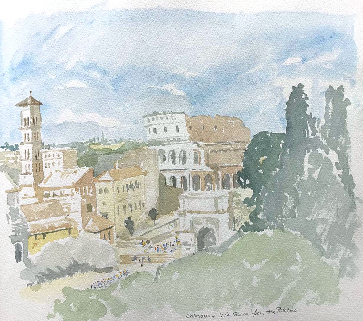
| The following day, the Colosseum and the Via Sacra from the
Palatine Hill, the myriad brightly coloured ants dotting the
pavement of the Forum below. |
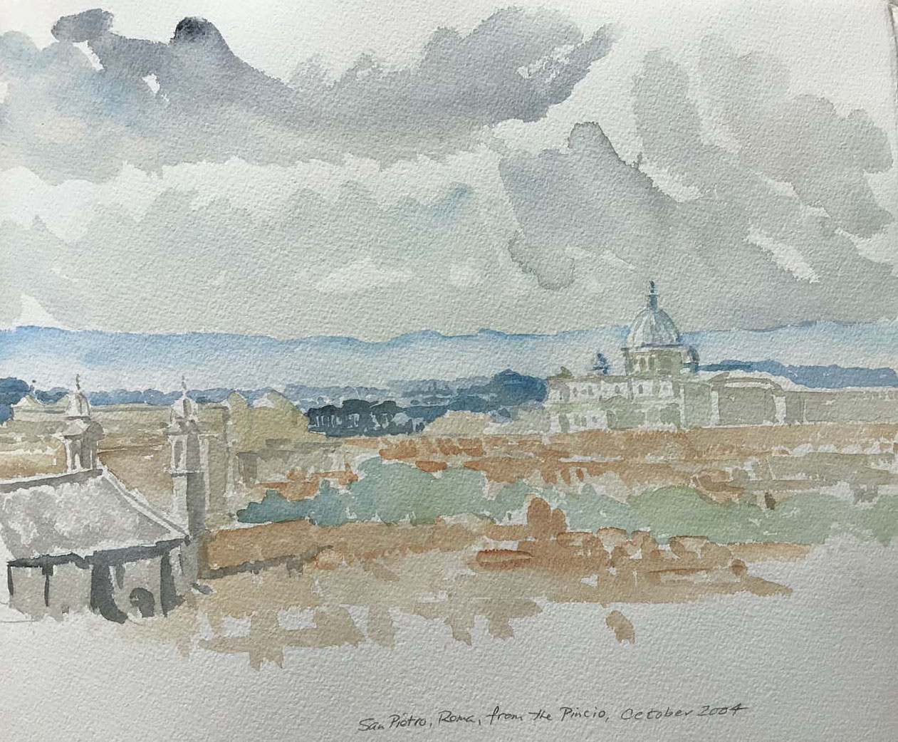
| St. Peter's and the Vatican from the Pincio. A day of very flat
light, and an awkward place to draw and paint. Again, there was
the flat top of a stone wall that allowed me a place to
stand, but there was also a rather annoyed vendor of coloured
prints of Roman scenes – annoyed because passersby were distracted
from examining his wares by me. |
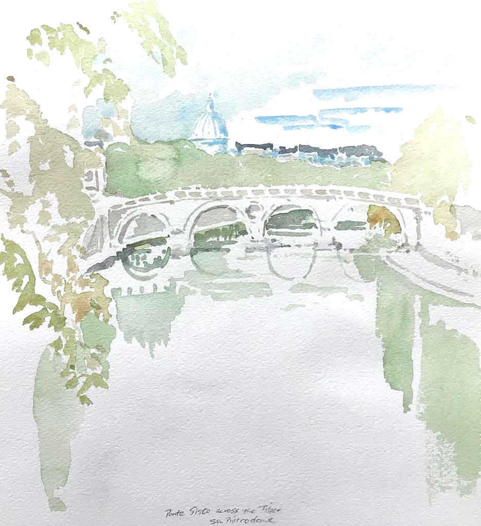
| The Ponte Sisto across the Tiber,with the dome of San Pietro
(St. Peter's) in the background. I stood with the book resting on
the stone wall directly above the river, sheltered from the heavy
traffic by the line of trees along the sidewalk, but got out of
there quickly and went to find a drink! |
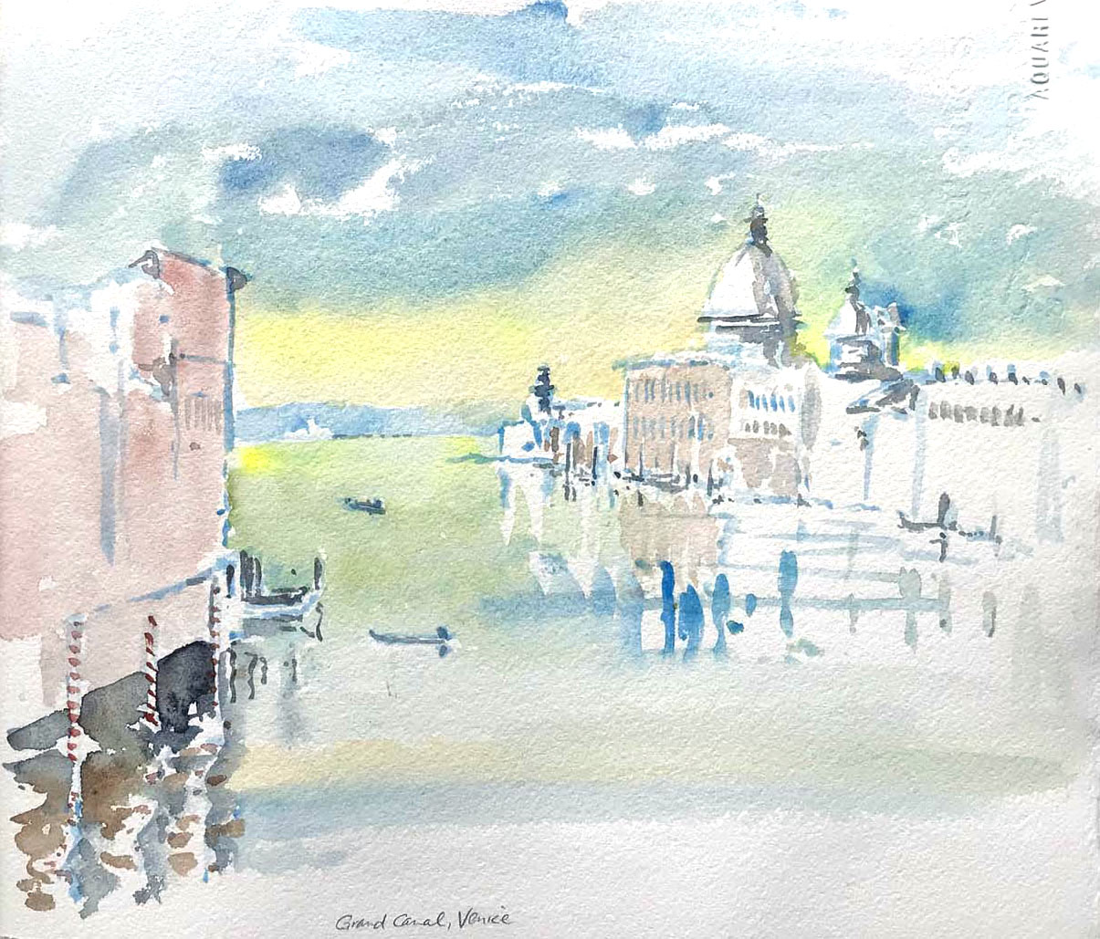
| The Grand Canal in Venice is sovcluttered, the footpaths and
bridges so crowded, it was impossible to wet the paper and paint
properly. Therefore, I did a pencil sketch invthe little book and
painted it from memory back in the room. The abstraction of this
actually helps, at least with my memory of it. |
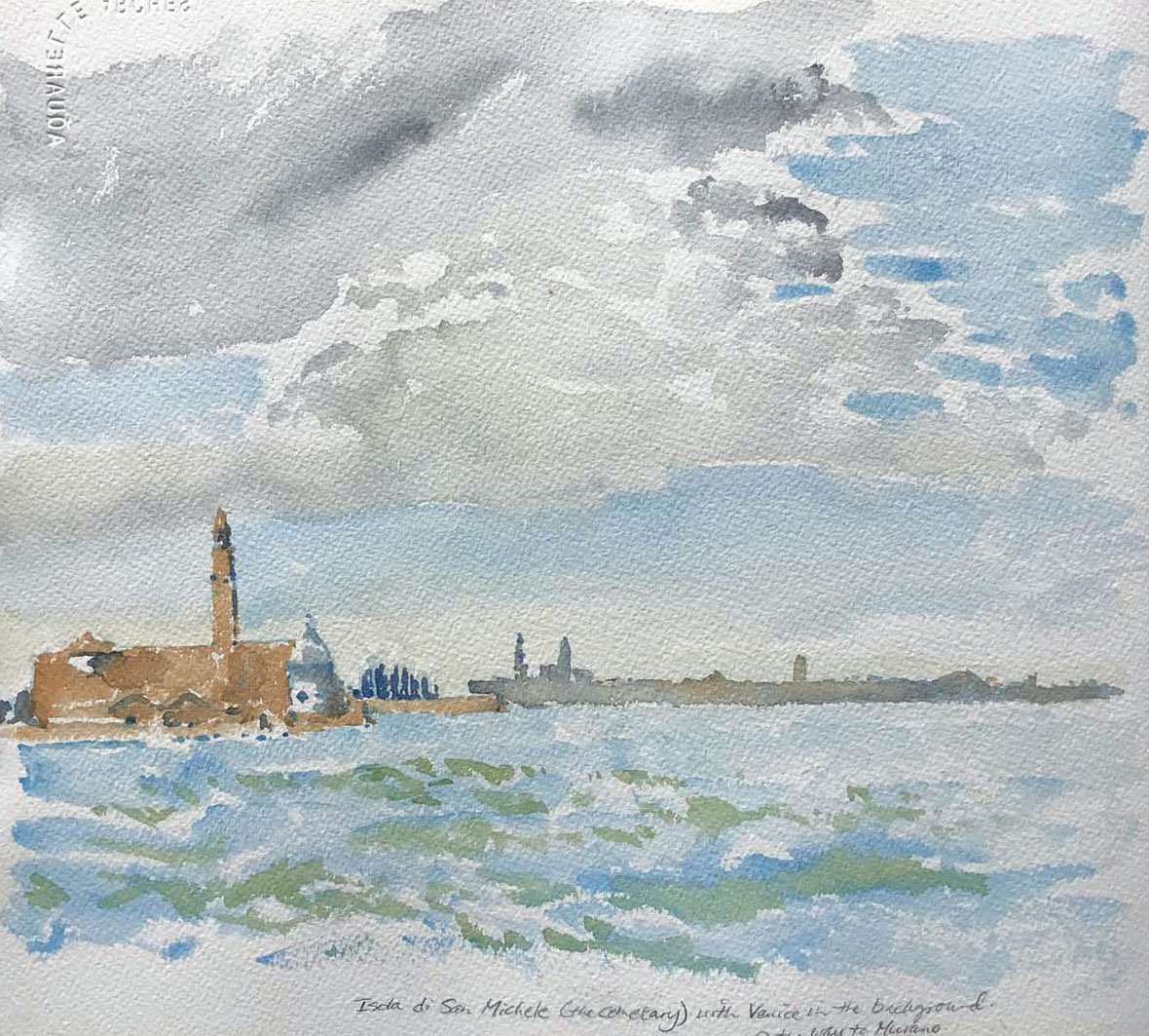
| The Isola di San Michele (the cemetery island) with Venice in
the background. A wind kicked up and chopped the water into
ultramarine and green slices. |
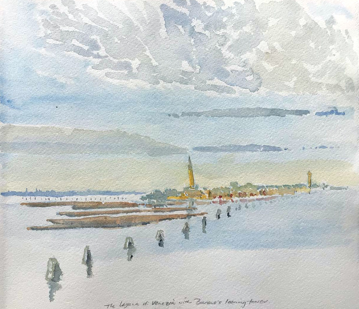
| We took the ferry out from Venice(the purple skyline in the
distance) to the islands in the lagoon. There was a special
tranquility there, so calm, the water so leaden and flat, the
islands punctuated with campanili. Again, I drew the scene in
pencil in the little book and painted it from scratch into the
bigger one back at the apartment. This is Burano's leaning tower,
looking like it will fall into the reeds some day soon. |