continued from the home page
and...
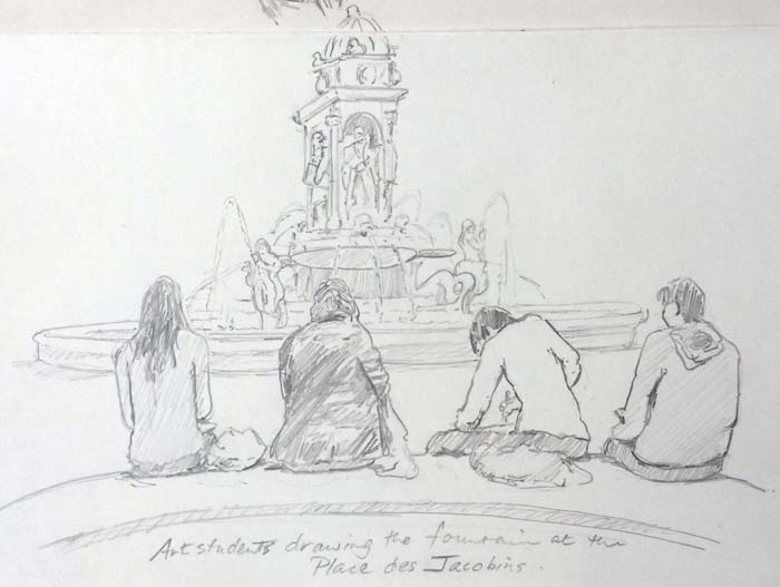
Updated June 16, 2022
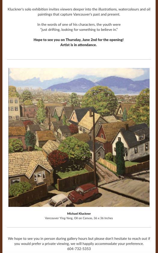
The show's over, lots of red dots...
And, Sunday June 19th at 7:40 am (if you happen to be up) I'll be chatting with Jennifer Palma on Global TV about The Rooming House.
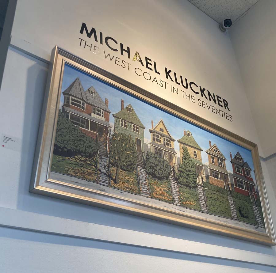
Updated June 9, 2022
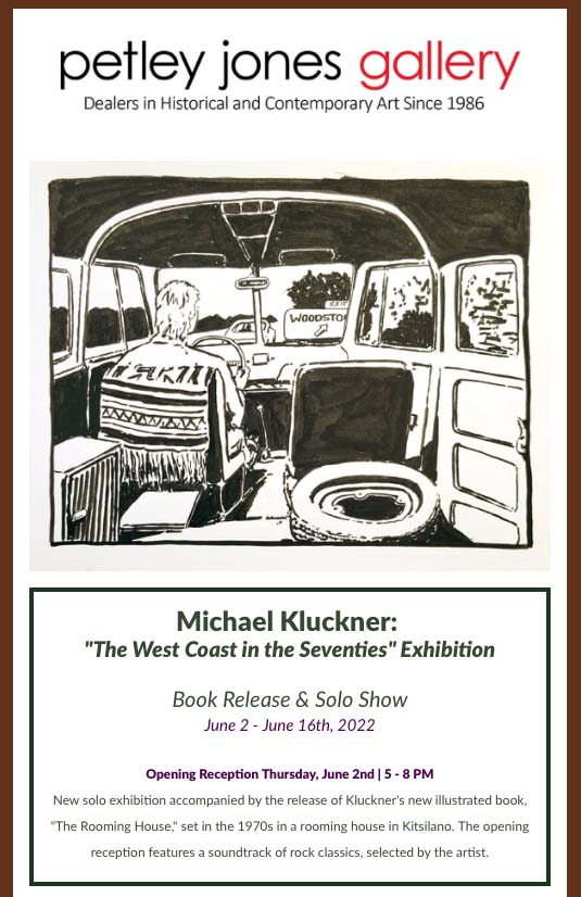
Publicity for The Rooming House and the gallery show from the Vancouver Sun and Galleries West magazine added to The Rooming House page.
Updated June 1, 2022
Petley Jones Gallery Website
Updated May 24, 2022
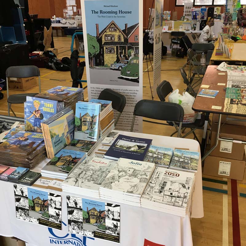
My little patch with Midtown Press's books at VanCAF just before opening on the Sunday. A great event for all the illustrators, comic book people and indie artists.
Upcoming Events:
• May 21st–22nd, 10-5, VanCAF at the Roundhouse Community Centre. I'll be there with all the books.
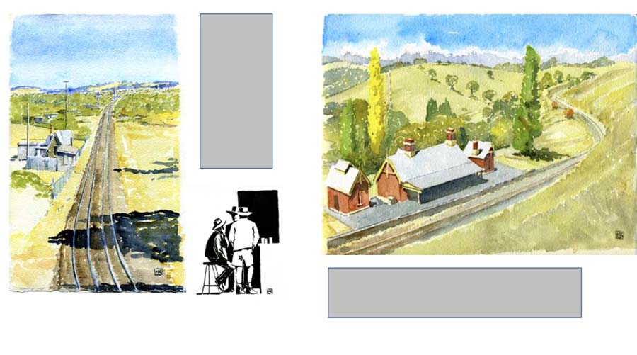
•June 2nd–16th: Gallery show and book launch for The Rooming House at Petley Jones Gallery. (More info to come).
Updated April 1, 2022
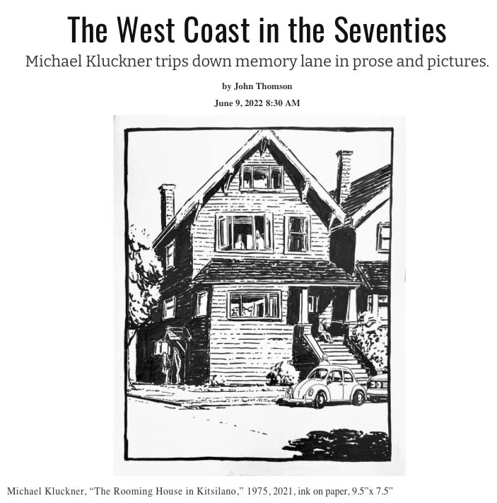
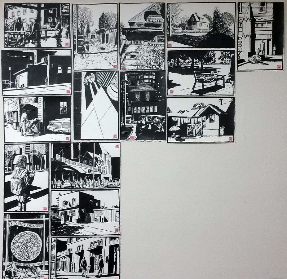
A review-essay in The Tyee on the book and its echo in the current housing crisis, added to this page.
Updated March 11, 2022
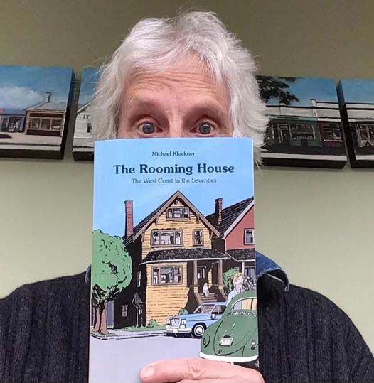
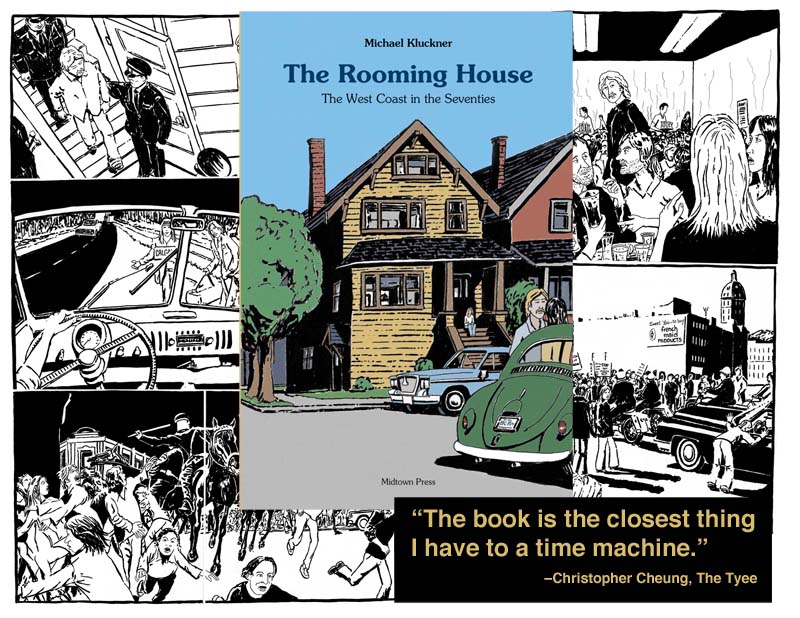
The Rooming House is here! Check it out on this page.
Updated March 8, 2022
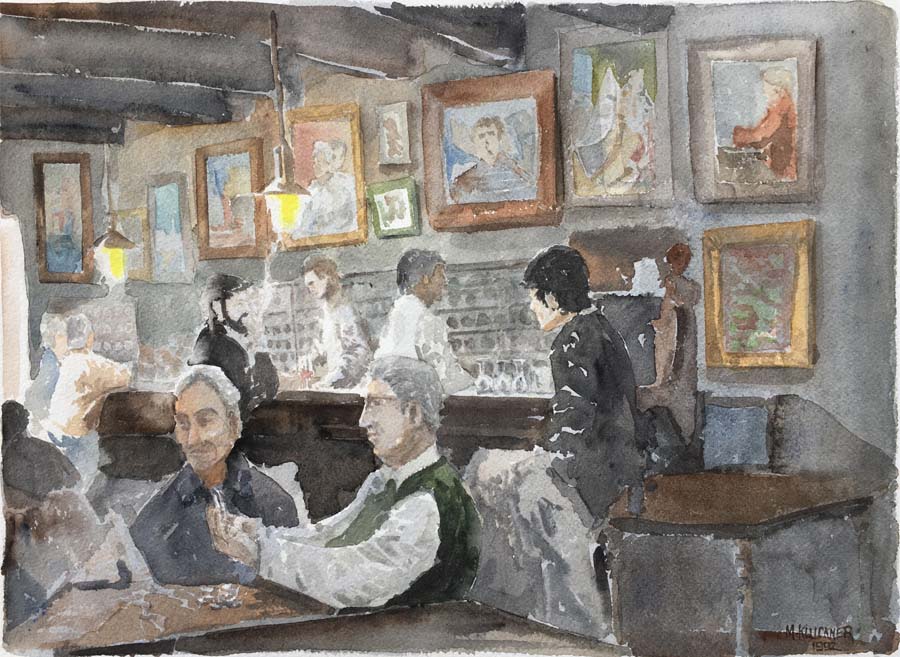
Found this in a folio at Petley-Jones Gallery, where I held exhibitions in the '90s.
The bar at Collioure, near the French-Spanish border, just before Christmas in 1992.
I've added it to the brief record of that 3-month trip.
Updated January 26, 2022
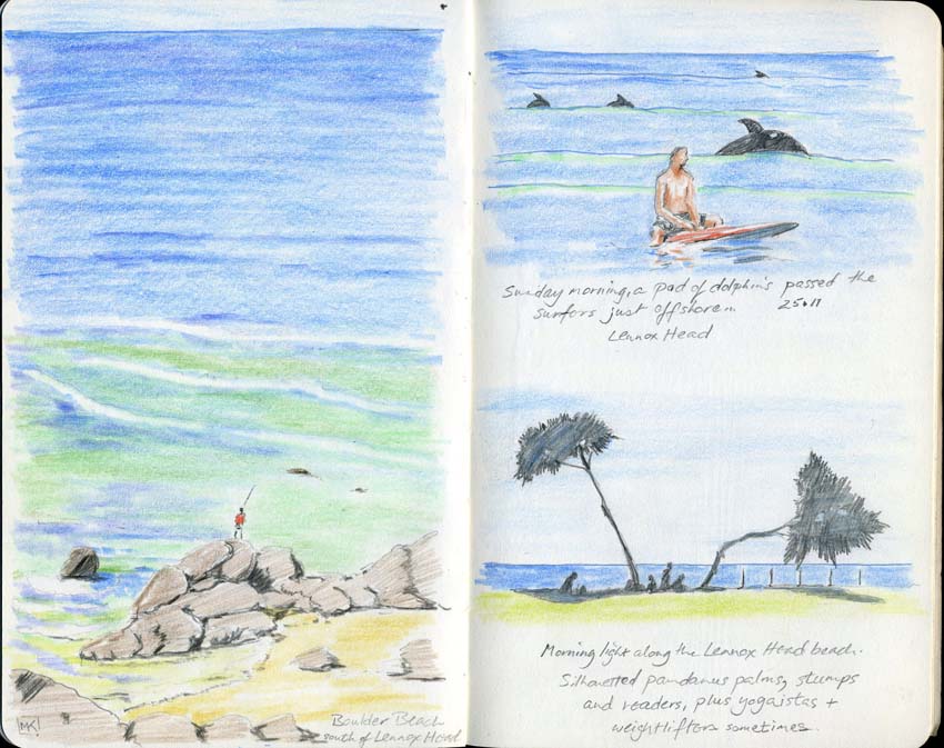
Sketches and photos from a month in Sydney, added to my travel page.
Updated January 16, 2022
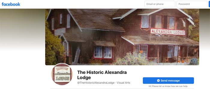
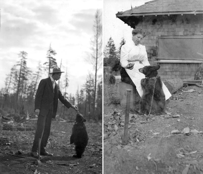
Lots of news about the Alexandra Lodge and its saviours: Shirley and Ken McKinnon.
I've added their material to my page on the Lodge going back more than 20 years.
You can also check out their Facebook Page showing the day-by-day progress.
Updated December 9, 2021
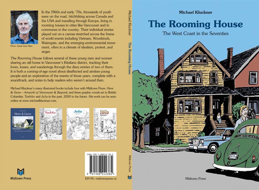
This will be the cover for The Rooming House, with appropriate 1970s type (Souvenir font!), designed by Denis Hunter.
Updated December 4, 2021
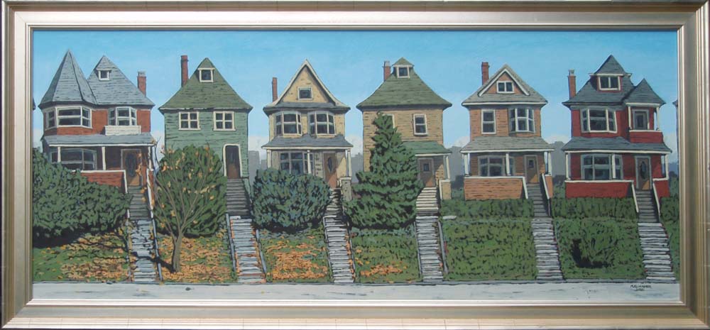
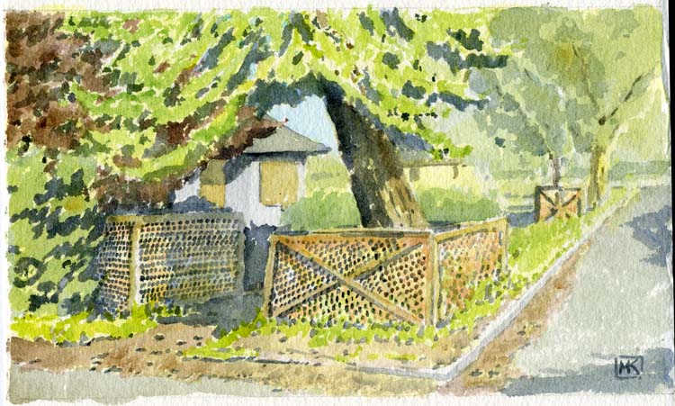
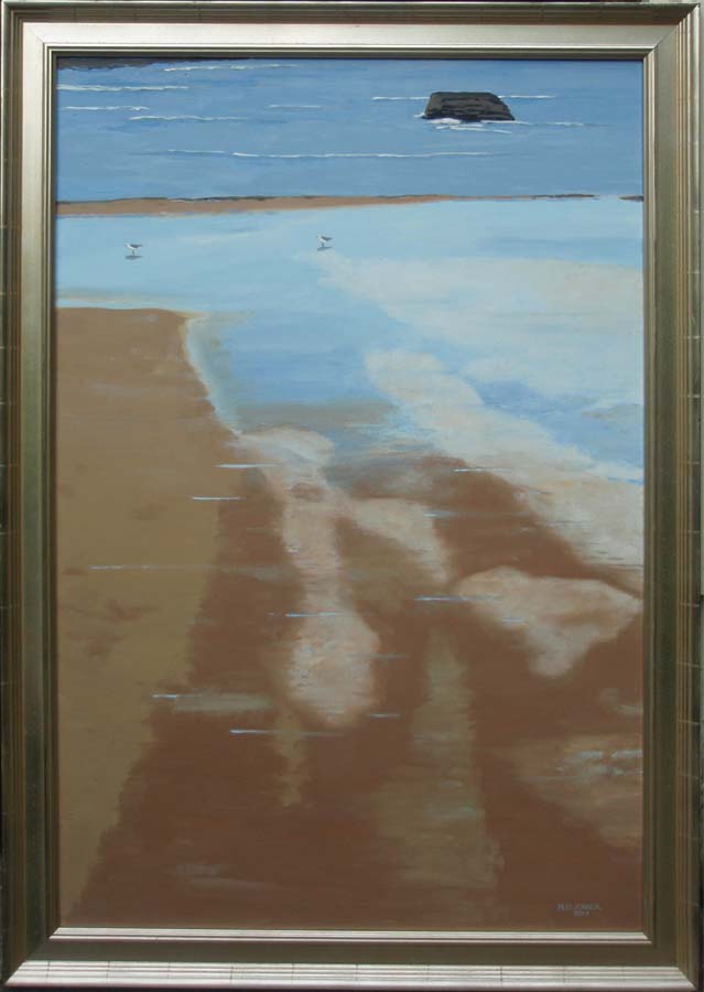
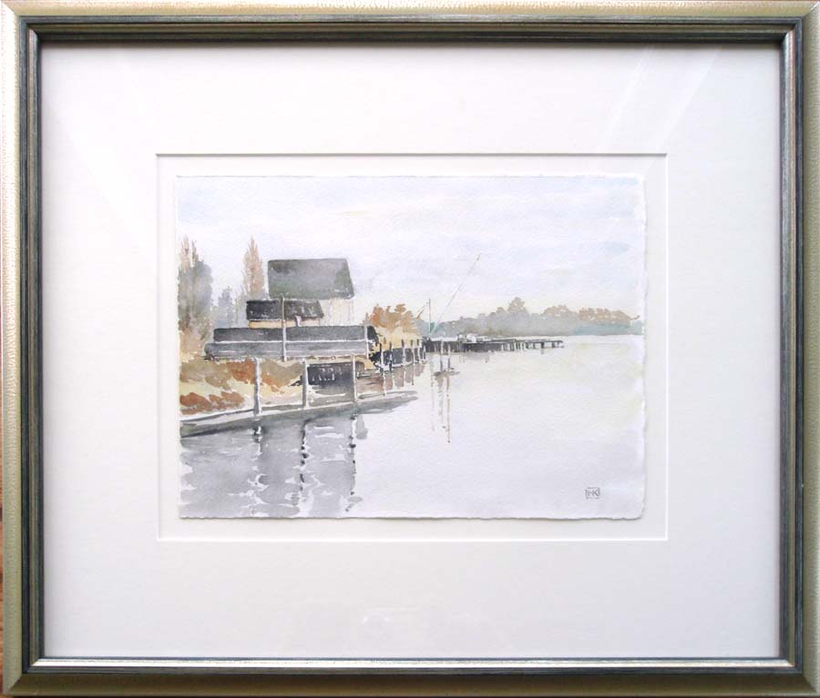
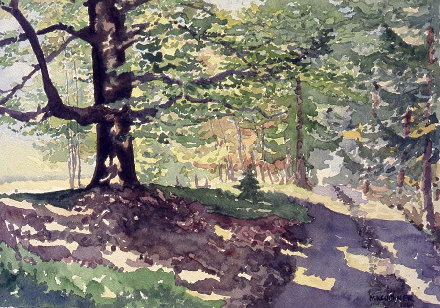
A couple more pictures added to my 'recent oil paintings' page.
Updated November 12, 2021
| For readers interested in the WWII Nikkei experience in
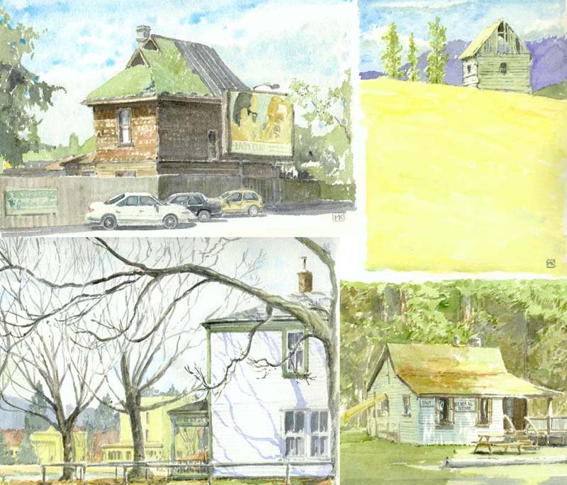
British Columbia: There is a request for information from a masters student at the University of Guadalajara. She is studying the impact of the internment on Nikkei families over the generations. You can find the link on the Wong's Market, Mayne Island, and Shuswap pages. As well, I've posted a link to an article that describes the search for the locations of Japanese-Canadian road camps in 1942–3 on the Blue River Store page. |
Updated November 7, 2021
Travelling during COVID? Just a few brief trips in British Columbia, captured here.
The first addition to my travel page since Japan in 2019...
Updated October 8, 2021
Mark your calendars for this: me blabbing about book projects, illustration media and so on.
Log-in details will be available on the Alcuin Society website. You can get the free tickets on Eventbrite.
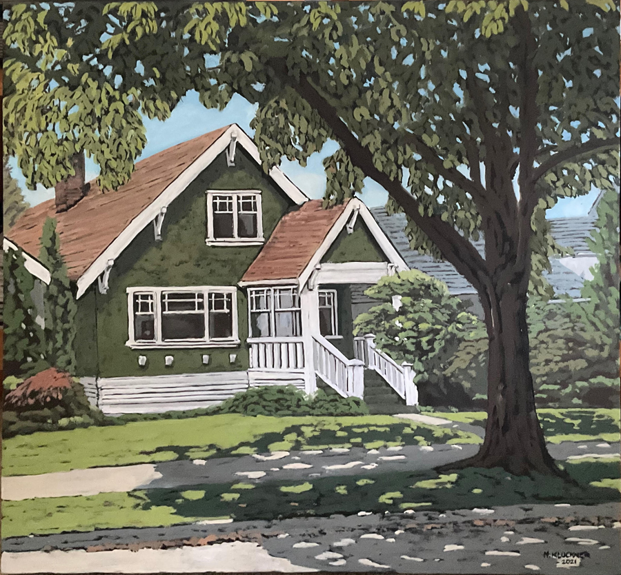
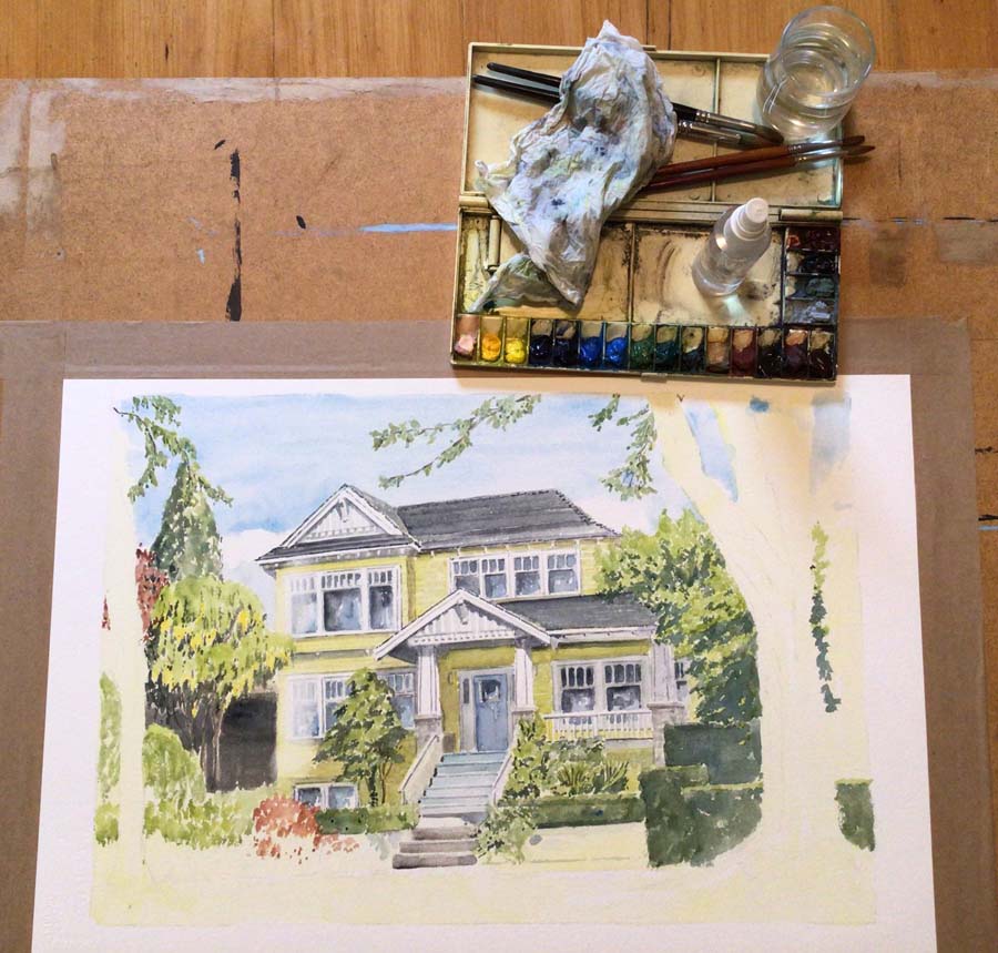
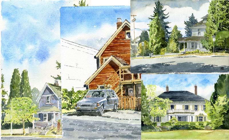
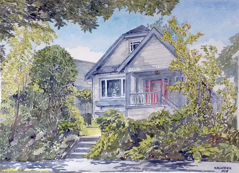
A couple more Vancouver house commissions added to that page.
Updated September 3, 2021
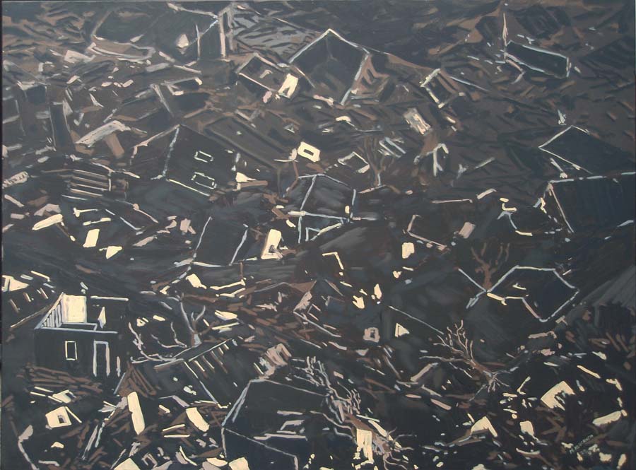
Ah, the romance of climate change, one of two oil paintings from last year that I just got around to posting on the oil paintings page.
Updated August 11, 2021
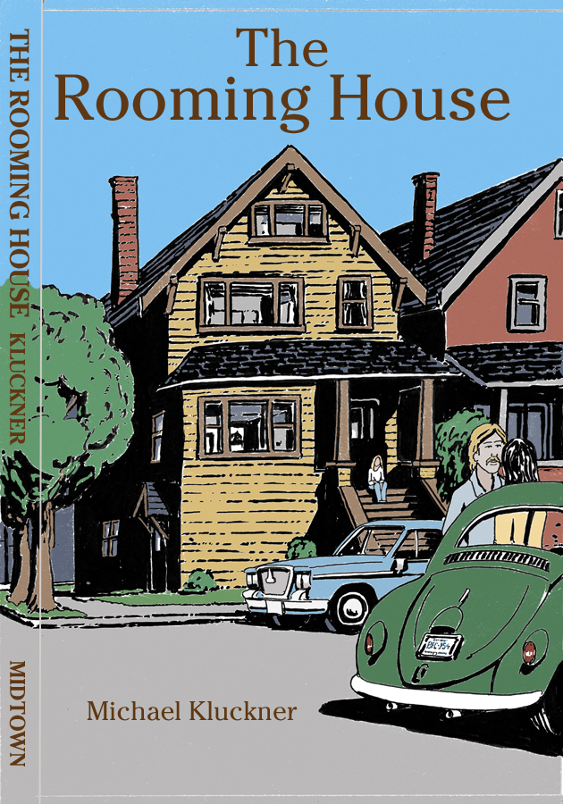
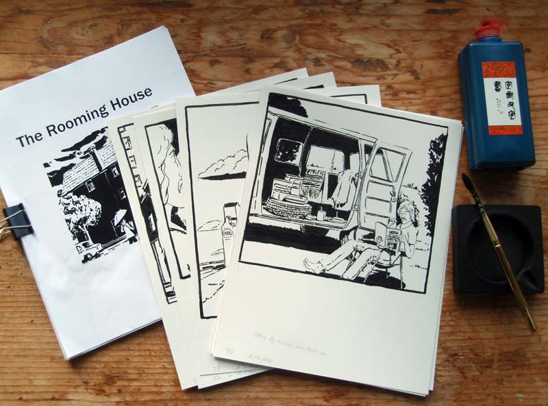
Inching toward completion, my illustrated novel set in the hippie '70s may be out by the end of the year, or maybe Spring 2022.
Updated June 30, 2021
More roadside memory and Indigenous history erased from BC:
the St. Anne's Church on the Chuchuwayha Indian Reserve of the Upper Similkameen Band
destroyed by arson...
Updated June 24, 2021
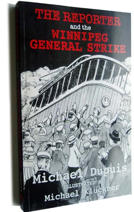
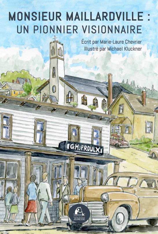
Illustrations for books by Michael Dupuis and Marie-Laure Chevrier, added to the "Projects Page."
Updated June 19, 2021
Another pleasant summertime commission in Vancouver (more bill-paying work!) added to the Commissions page.
Updated June 2, 2021
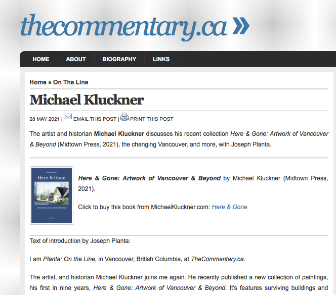
An interview with Joseph Planta on thecommentary.ca
Updated May 17, 2021
Because of the COVID delay in the show I was to have at
VanDusen Gallery, which has been postponed probably for a year,
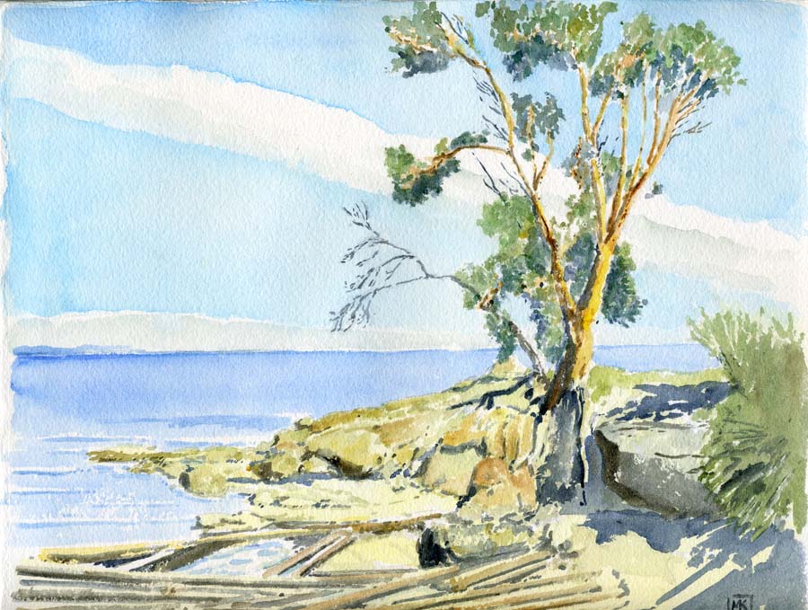
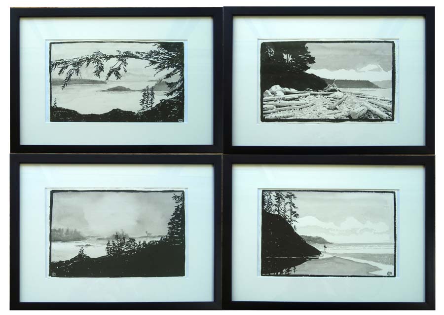
I have posted the unsold watercolours from Here
& Gone onto this page.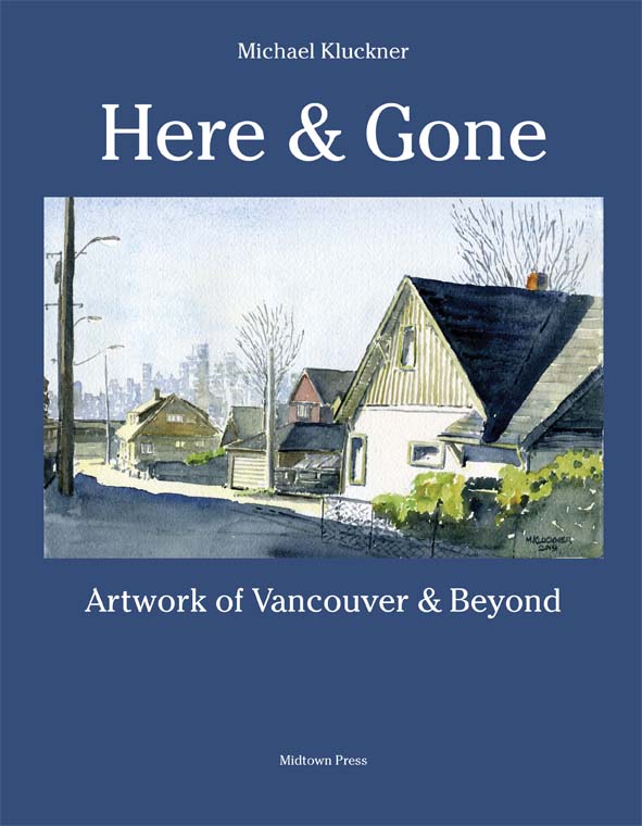 |
Updated May 12, 2021
It's the time of the year for painting commissions for people – all watercolour this year so far.
The City looks especially beautiful. Are we seeing it through COVID eyes?
Updated March 21, 2021
Reviews of Here & Gone by Martin Segger...
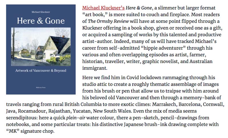
(Read the whole review here)
And a review of the second edition of Toshiko by Phyllis Reeve ...
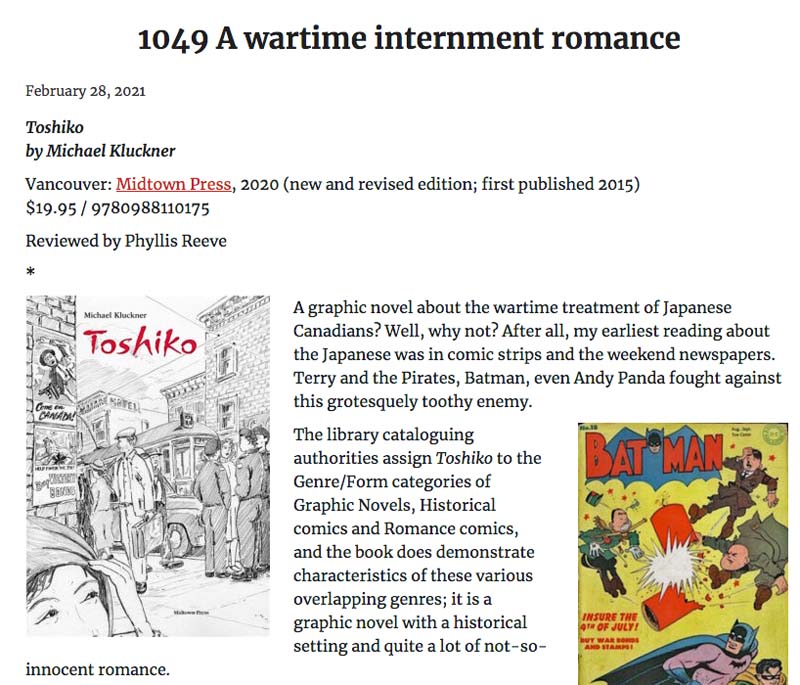
Read the entire review here.
Updated January 24, 2021
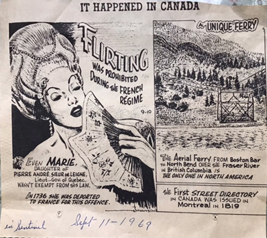
A rare addition of a new page to "Vanishing BC online":
the Boston Bar - North Bend aerial ferry that was in service from 1940 - 1986
... Happy New Year update, January 6, 2021
Now that the Christmas postal lineups are over, I've reinstated the direct-sale e-transfer book offer for Here & Gone
and my 3 graphic novels, Toshiko, 2050, and Julia:

***
John Ackermann at CKWX1130 did a "Bookshelf" column on Here & Gone, with tweets and retweets by other fans of it.

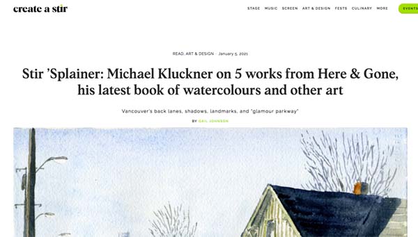
And, the new arts and culture digital publication stir invited me write about a few favourite pieces from H&G:
And, carrying on through the COVID drift, The Rooming House illustrated novel set in the '70s continues to make progress in words and brush and Chinese ink...
...updated December 12, 2020
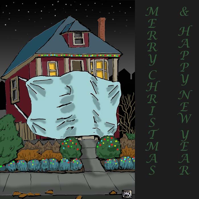
– Happy Hanukkah, too, in this weird COVID year.
...updated December 11, 2020
Thanks to everyone who ordered copies of Here & Gone online.
I've suspended the "Order Form" link until after Christmas due to post office lineups.
If you would like multiple copies and are willing to pick them up from an East Van porch, please contact me.
Otherwise, your local bookstore will have copies – please shop locally if at all possible!
... updated November 23, 2020
Here & Gone is #12 on the BC Bestseller List; #15 last week!
... updated November 10, 2020
The book signing at the Museum of Vancouver for Here & Gone has been postponed due to new COVID-19 restrictions
...updated October 30, 2020
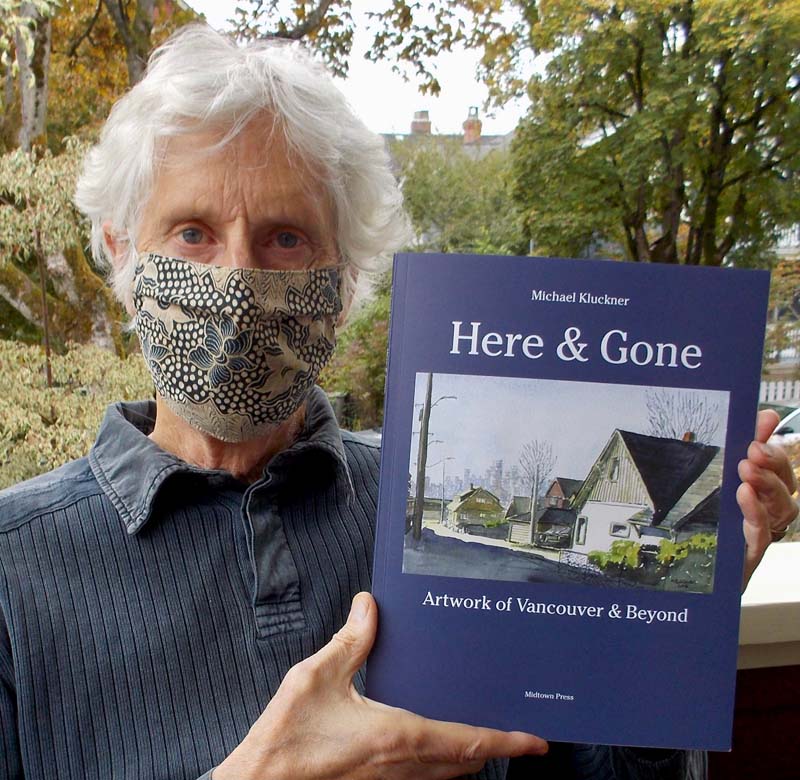
I am delighted with my new book Here & Gone, which has some artwork of old Vancouver as well as travel art in the back section:
an antidote to the COVID blues!
I have added it my Books page, and put an overview with some of the page spreads here.
...updated September 24, 2020
A blast from the past: talking with retired CBC broadcaster Mark Forsythe,
whose "BC Almanac" show helped get Vanishing British Columbia started 20 years ago.
On the BC Historical Federation website, click below...
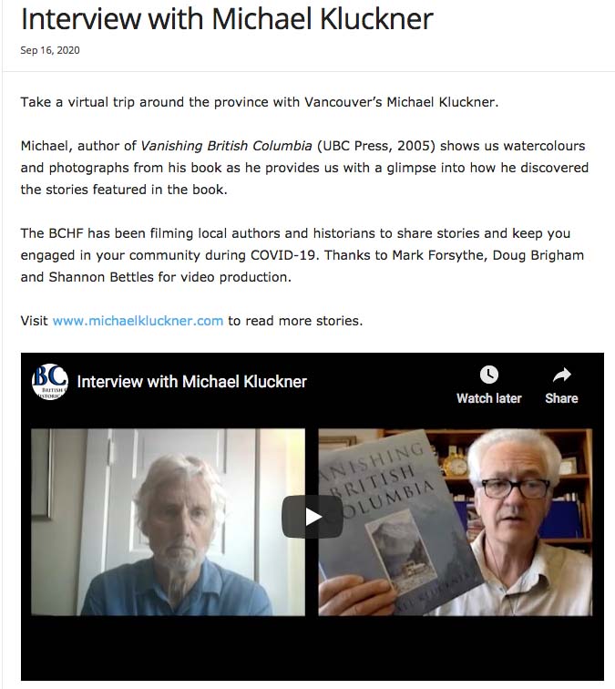
...updated September 15, 2020
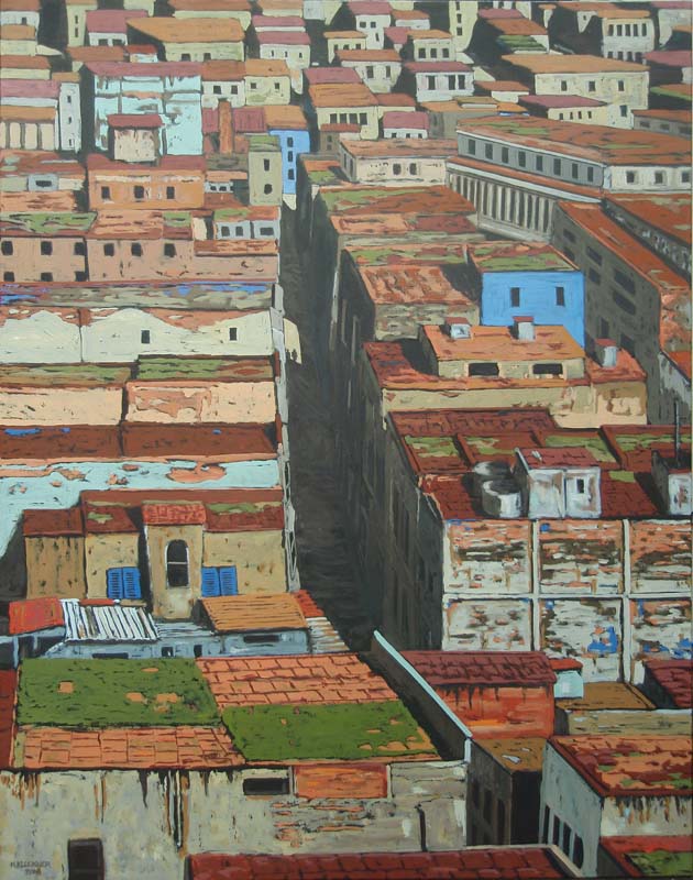
...another oil painting looking for a home, while I think about places travelled and inaccessible due to COVID.
More here.
...updated September 5, 2020
The second edition of Toshiko is published!
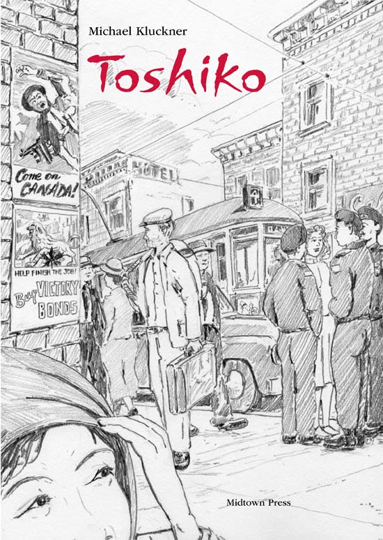
It is 12 pages longer and has a section of notes, plus a bibliography and index.
Go to the Toshiko page for details on it.
...updated August 16, 2020
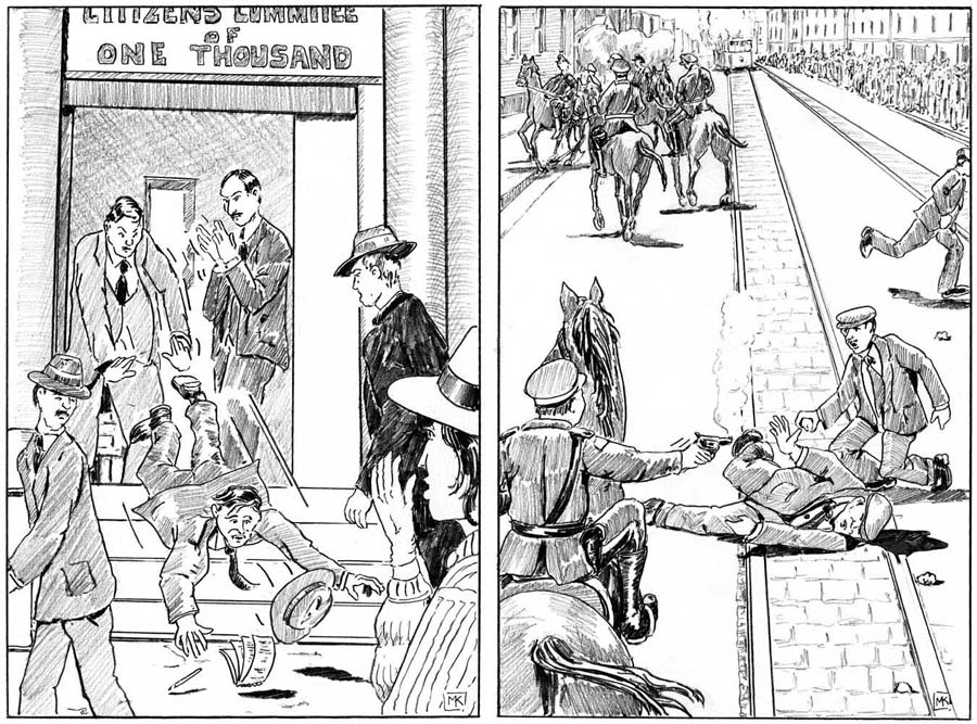
Commissioned illustrations from a forthcoming novel set during the Winnipeg General Strike of 1919.
I will write more about it – the author and the title and so on – when the book is published.
This was a great project as an antidote to COVID-drift.
...updated June 13, 2020
Pandemic housekeeping: I have redone the pages of watercolours from my books to show what's left and make it easier to browse.
Pictures from Vanishing Vancouver: The Last 25 Years and Vancouver Remembered, and ...
... the remaining watercolours from Vanishing British Columbia
...updated June 4, 2020
With the pandemic going on, there are no events to report.
Here & Gone (see below) is finished and I'm working on The Rooming House,
an illustrated novel set partly in Vancouver in the tumultuous early 1970s.
The illustrations are all in the style of woodcuts.
...updated April 5, 2020
There are now eBooks available for Toshiko:
In English: eBook: https://www.kobo.com/ca/en/ebook/toshiko
$9.99
En français: epub: http://vitrine.entrepotnumerique.com/resources/9782924722107
14,99$
...updated March 1, 2020
Here and Gone will be the title of the new book, coming in early 2021.
There will be some local (i.e. Vancouver) stuff ...
(the grey boxes being text captions) and some of my travel images from the past 30 years in the "gone" section...
********
And, I've posted some photos sent in of the old Sandy Point Resort on Shuswap Lake.
...updated January 16, 2020
Two projects for 2021 that are keeping me busy all this year:
A hybrid novel/graphic novel called The Rooming House, set in the 1970s, and...
A project tentatively called "Don't Belong Here Anymore" of recent artwork about Vancouver (and elsewhere).
It will be a show in the Spring of 2021 and probably a small book.
And, Alexandra Lodge is for sale again.
...updated November 6, 2019
A recent trip to Japan and playing around with traditional Japanese ink and paper,
one of the many journeys chronicled on my Travel Page.
It is linked to a little think-piece about Japanese painting, its traditions and techniques.
..updated October 21, 2019
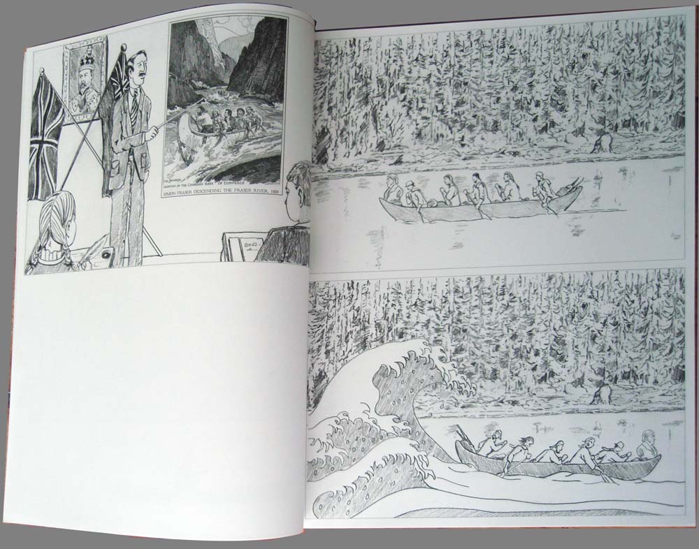
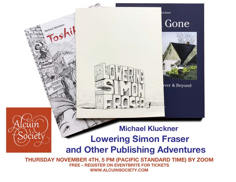
| The most interesting, at least most unusual, project of last
year: Lowering Simon Fraser, a
"bookwork" with lead artist Maddie Leach, published by the
Contemporary Art Gallery in Vancouver. |
...updated September 25, 2019
| I've finished the revisions to Toshiko
for the upcoming second edition (the first one is sold out).
More adventure, a more plausible romance and more complete
characters in a slightly expanded book. Stay tuned for a pub
date! |
...updated August 16, 2019
 |
...updated July 24, 2019
Summertime in the city (Kits Beach sunset), added to the brush-and-ink drawings here,
... and added a bit of information about my early, self-published books to my books page.
...updated May 28, 2019
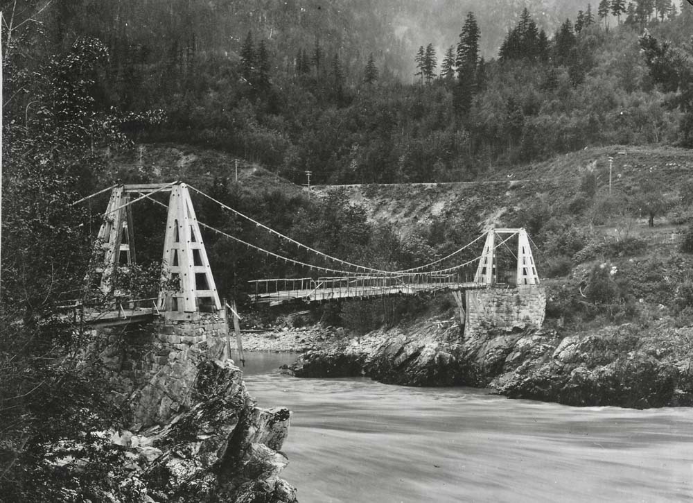
A few fabulous & rare images of Alexandra Bridge and Spuzzum added to those "Vanishing BC" pages
...updated March 24, 2019

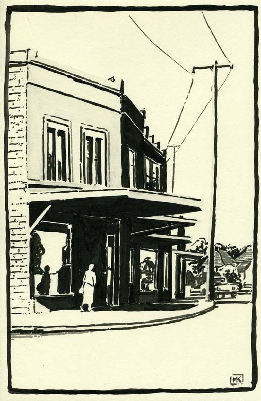
| These are tone drawings with the Chinese ink stick and
brush (see the entries below for June and July of last year)
laminated onto a decorative paper and then onto mulberry paper
and glued into two scrolls. I've been wanting to do a scroll
for years and finally got around to it in time for this year's
Finn Slough Art Show, which I've participated in at various
times over the past decade or so. The show opens April 11th at
the Richmond Museum and Cultural Centre; I've put these images
on my chiaroscuro page and also on
the Finn Slough historical
page on this website. |
...updated March 17, 2019
...updated March 8, 2019
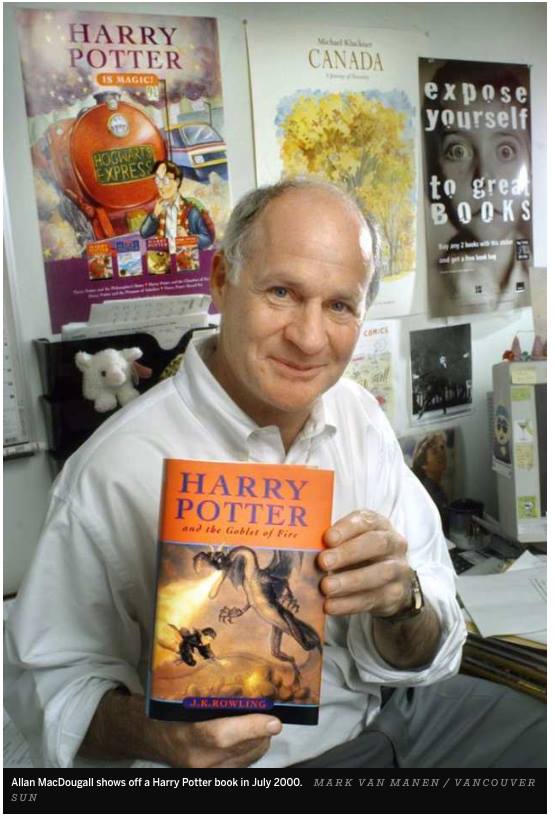
| RIP Allan MacDougall (1947 – February 19, 2019), who died
following a terrible 10-year decline with Alzheimer's. Allan and
Mark Stanton got me going in publishing in 1981–2 by
distributing my early books, then came into my life again as
distributors for Whitecap around 1990, then published 4 books
under their Raincoast imprint from 1996 to 2000. A publicity
photo of him holding one of the Harry Potter books – his
greatest business triumph as the Canadian distributor of that
series – showed he had a poster for my Canada
book in his office. In the same room with fame, indeed. |
...updated March 3, 2019
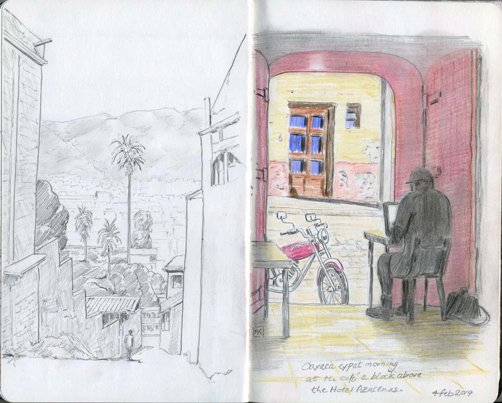
Back out travelling again with the sketchbook, this time to Oaxaca and other places in Mexico.
...updated January 11, 2019
Correspondence about the Quiney houses in Kitsilano prompted me to redo that page with images from Kitsilano pioneer days.
... updated December 30, 2018
Coloured-pencil travel drawings from trips in 2018 to Banff and Australia.
Another trip linked from my travel page.
...updated November 8, 2018
Moi speaking about "Julia" at the Vancouver Historical Society in October, 2018
on YouTube, and ...
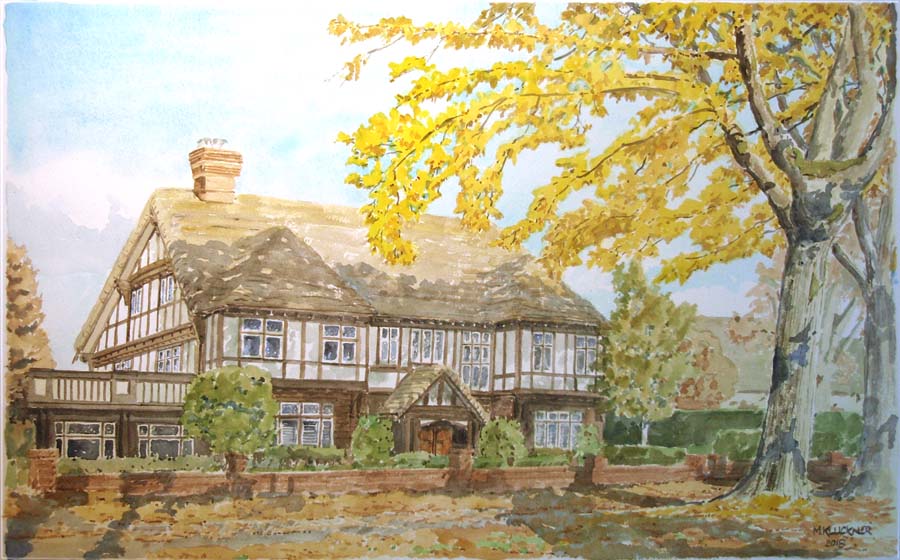
... a final watercolour commission for the year of a fine Vancouver Shaughnessy home, added to the Commissions page.
...updated September 29, 2018
A wall in the studio is filling up with chiaroscuro - brush ink drawings, all for sale on this page.
...updated September 4, 2018
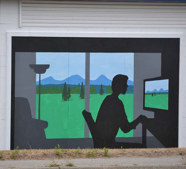
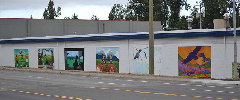
| "New Reality," my 8 x 12 foot contribution to Susan
Gorris's wonderful mural project for a building on the western
outskirts of Aldergrove, BC, about 270th Street on the Fraser
Highway, involving 10 artists. Fun to work (for the first time
ever) at that size and in acrylics. |
...updated August 11, 2018
I've added a page of purely black & white artwork, one of the series of pages linked from the art index page.
... updated August 6, 2018
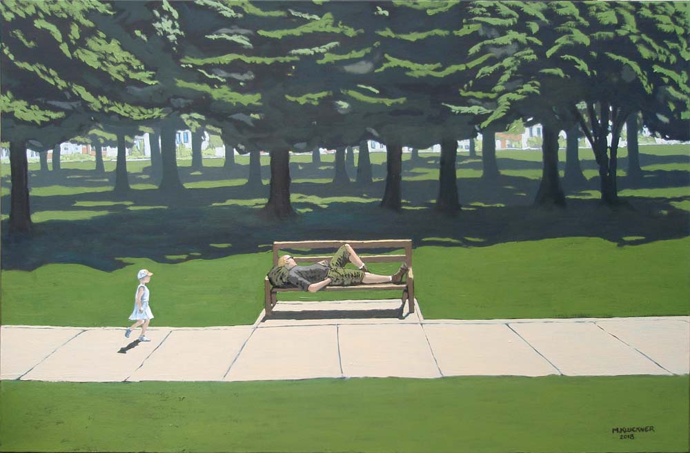
| Summertime seems to be oil painting time this year –
fewer of the commitments that break up the day, weather too
hot to do much outside from midday till 5 or so. Unlike the
other types of artwork I do, oils require a few hours (at
least) to justify getting everything dirty and then cleaning
it up. The two below are added to my painting
page. |
...updated July 6, 2018
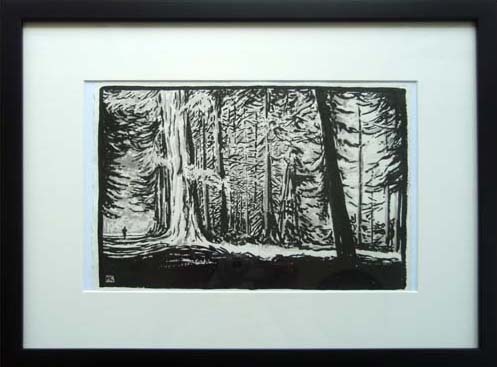
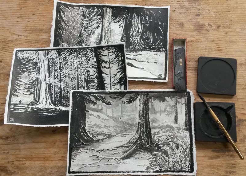
Second set with the Chinese ink stick and stone, a bottle of Chinese ink, and a brush
...updated June 19, 2018
The great Julia Road Trip is ready to go, with these stops ...
•Rossland Museum & Discovery Centre, June 26, 7 pm.
•Signing at Otter Books, Nelson, June 27, 12-2
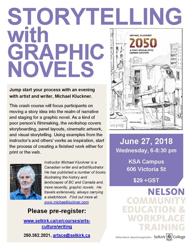
•Workshop on graphic novels at Selkirk College, Nelson (see poster below)
• Nelson Public Library, June 28th, workshop for teens 4-5 pm
Lecture on the book at 7 pm
• Bookland, Vernon, June 29, 3-5
• Salmon Arm Public Library, June 30th, 2 pm.
...updated June 10, 2018
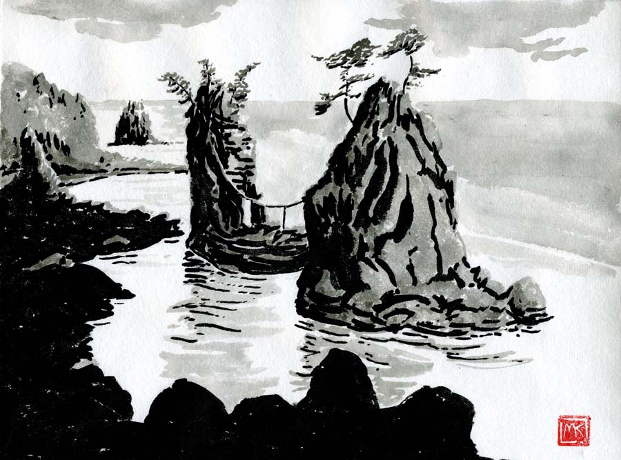
| I've painted a lot of black-white (without any
intermediate tones) chiaroscuro images in the last 20
years, including the illustrations for "Wiseacres" way back in
1999. Several years ago I bought an ink stick and stone in
Taiwan and just recently decided to do some tonal paintings of
the coast with them, adding solid black from a bottle of
Chinese ink. This is the first go – when I get more time I
will put up a proper page in my 'artwork'
section on all the monochrome stuff. SOLD |
... updated May 11, 2018
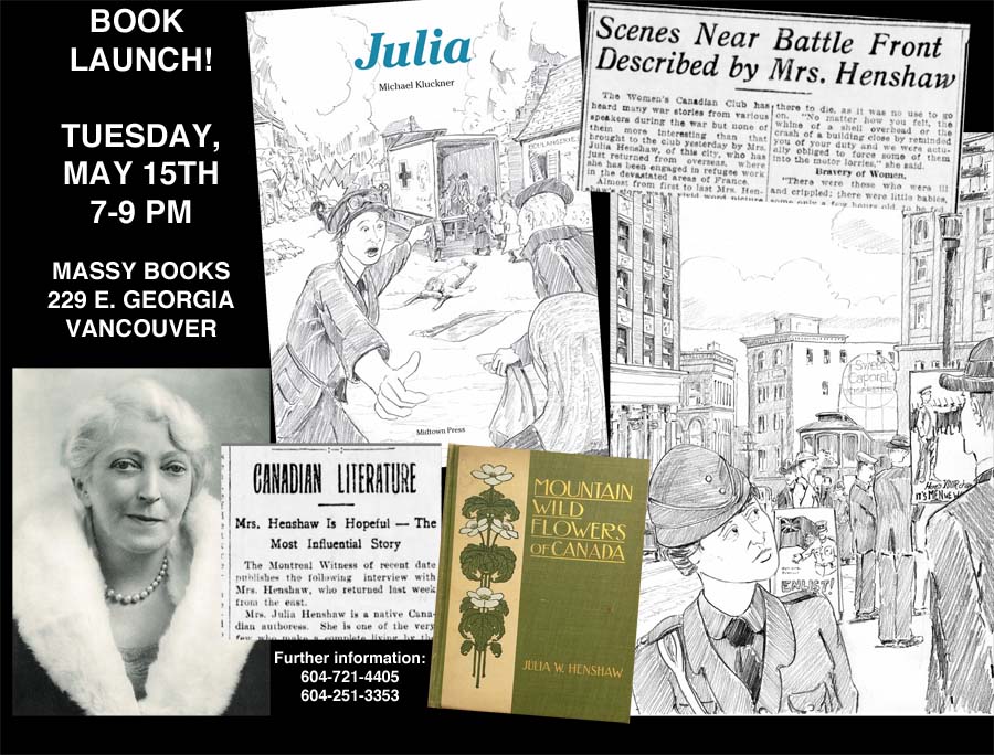
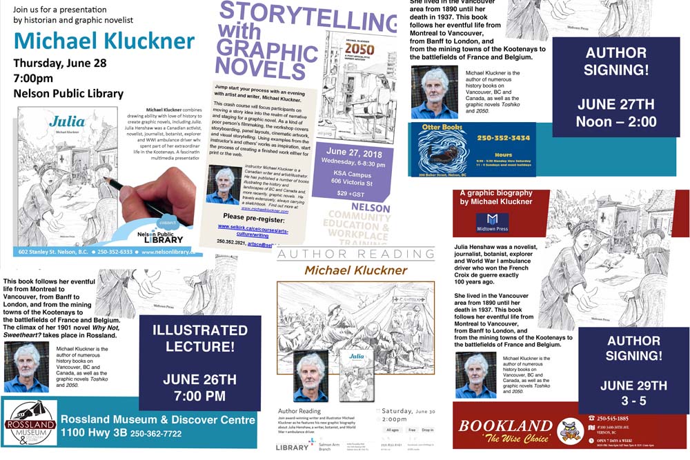
| Here are the upcoming public events for Julia: • LAUNCH at Massy Books, 229 East Georgia Street in Vancouver's Chinatown, May 15 at 7 pm • VanCAF, the comic arts festival, at the Roundhouse Community Centre on Saturday and Sunday May 19 and 20. I will be there for much of the weekend at the Midtown Press table. • A brief talk and signing at Black Bond Books in Ladner, June 9, 10:30–12:30. ...and then later at ... • Rossland Museum & Discovery Centre, June 26, 7 pm. • Workshop on graphic novels at Selkirk College, Nelson (see poster above) • Nelson Public Library, June 28th at 7 pm • Bookland, Vernon, June 29, 3-5 • Salmon Arm Public Library, June 30th, 2 pm. • WORD Vancouver, September 30th, time TBA • Radium Library, October 16th, 6:30 pm • Whyte Museum of the Canadian Rockies, Banff, October 17th, 2 pm • Friends of the BC Archives, Victoria, October 21st. • Vancouver Public Library main branch, November 1, 7 pm. • Vancouver Historical Society, Museum of Vancouver, October 25th, 7:30 pm. • Langley Heritage Society's Douglas Day banquet, Fort Langley Community Hall, November 16, 2018 |
...updated April 11, 2018
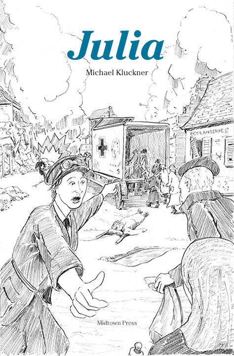
| My graphic novel/biography of Julia Henshaw, a notable writer
and explorer who won the Croix de guerre for her work during
World War I, exactly a century ago, is about to be published! There's a preview here. Details about the launch and public events will be posted here and on my Facebook page. |
... updated February 11, 2018
| The Alcuin Society of book collectors invited me to
speak at their AGM in the summer of 2017 and published my talk
– in effect of an overview of my career so far – in their
Summer 2017, No. 176 issue. There is a pdf of the
article downloadable here or
my clicking on the image above. |
... updated February 9, 2018
Artwork and a bit of information from Mérida, Mexico, one of the many journeys
that are part of my travel page.
...updated February 4, 2018
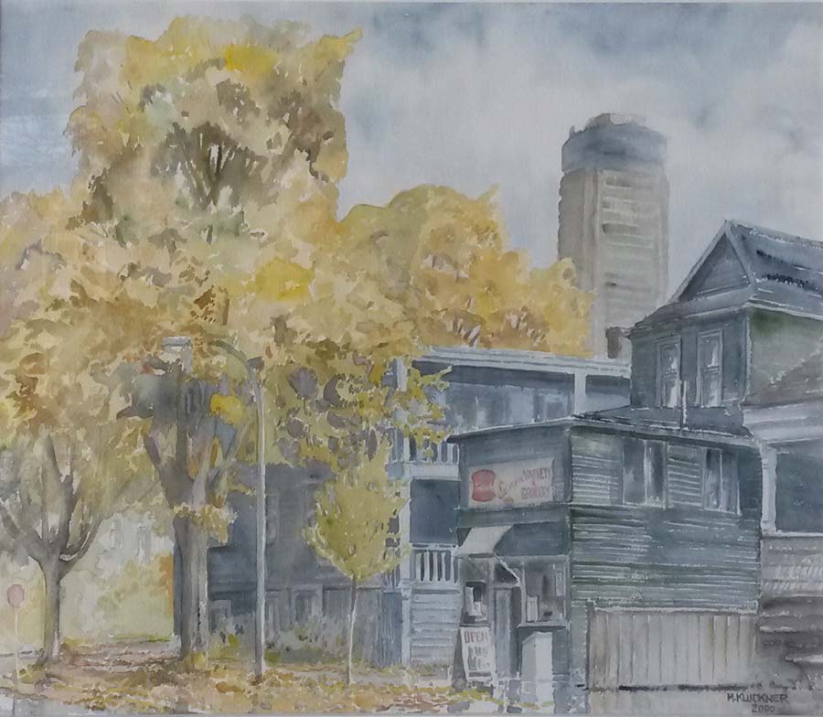
| The relentless rain in Vancouver reminded me of this
watercolour from late 2000 (unsold by the way, hint hint); the
little store closed, was renovated, and then reopened as a
cool café called Cardero Bottega, and the neighbouring
buildings are still going strong. However, the Landmark Hotel
in the background mist, the tallest building in Vancouver in
its day, is about to be demolished and replaced by luxury
condo towers. Sic transit gloria mundi. And, a great set of photos of Coalmont from back in the day. |
...updated December 19, 2017
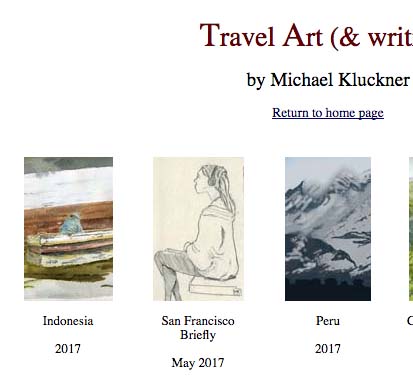
My last two trips of 2017, Indonesia and a brief one to San Francisco, now posted on the travel page.
... updated December 4, 2017
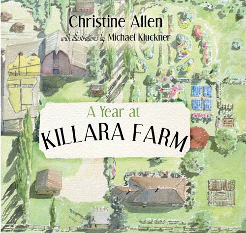
This is 5 years old and I am suddenly realizing I never put
Christine's excellent book, which I illustrated, onto my books page.
...updated December 2, 2017
"Sproat Lake," a commission from last summer added to the Commissions page,
and the story of the Uyede family at Bamfield on Vancouver Island.
...updated November 6, 2017
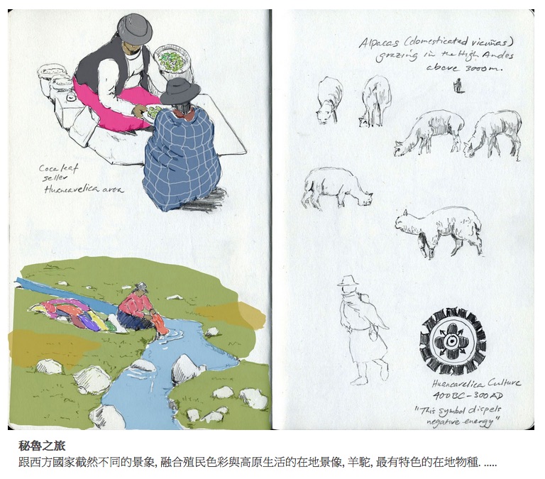
| It's been a long time since I posted anything here. Some of my
travel sketches from Peru and Mexico are on a Taiwan
lifestyle/fashion/art site called Muse
Creative, with the brief article in both Chinese and
English. And, we're just back from a month in Indonesia, so the
usual images and text will be added to the travel
page some time soon. |
...updated August 23, 2017
Not much happening this summer as I slog along on the latest graphic novel/biography,
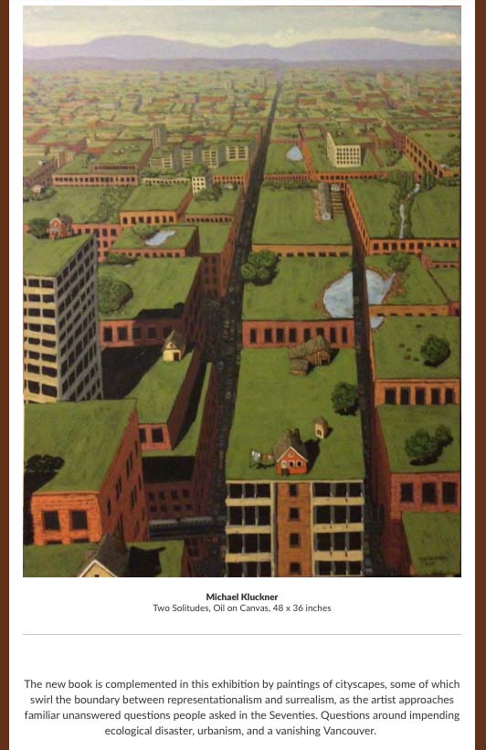
but this publicity in the Seattle Times was very welcome. The "Two Solitudes" painting
is on my website here.
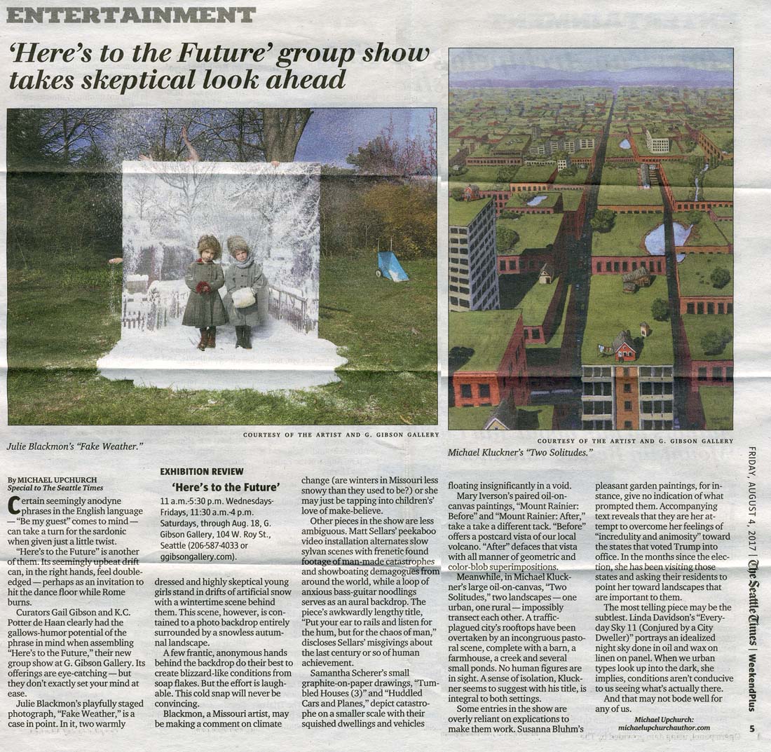
...updated July 15, 2017
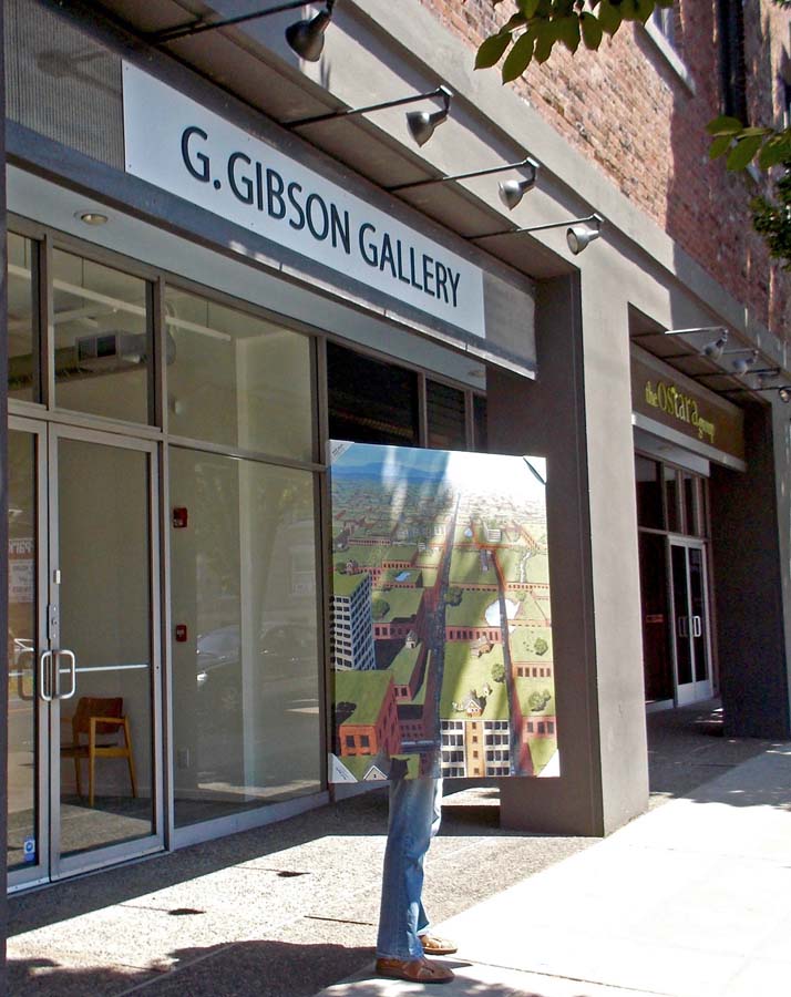
I took "Two Solitudes" to Seattle for the "Here's to the Future" exhibition at the Gail Gibson Gallery in the
Queen Anne neighbourhood. Exhibition website is here.
...updated June 2, 2017
Successful show at VanDusen – the "preview" link below is up-to-date on what sold.
An out-of-the-ordinary talk on Monday, June 5th, to the Alcuin Society, the national organization
of bibliophiles, at Hycroft in Vancouver following their AGM at 7 p.m.
...updated April 21, 2017
| "Mainly Vancouver," which is maybe my Last Picture Show (at
least as a solo show), opens on Saturday, April 29th at VanDusen
Garden Gallery, on Oak near 37th in Vancouver; opening reception
that afternoon from 2:30 – 5:30. Lots of watercolours done as
illustrations for my various books, plus chiaroscuro brush &
ink drawings and oils. There's a complete preview here. |
...updated April 5, 2017
|
Below: another oil added to the "recent" file: 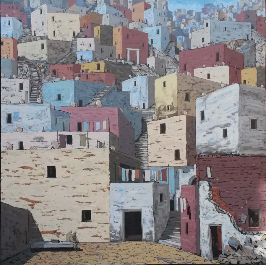 Tangier (or was it Guanajuato), 2017, Oil on linen, 40 x 40 inches, SOLD |
...updated March 6, 2017
...updated February 12, 2017
Peru, with a brief visit to Ecuador, the latest in the long list of trips on my travel page.
...updated January 3, 2017
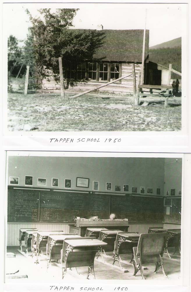
Some photos from Al Hosokawa about his Japanese-Canadian family in the Shuswap post-war.
(The best rural school photo interior I've seen)
... updated December 21, 2016
+ reviews and comments about 2050 and Toshiko
• and a very informative piece by Al Hosokawa about Japanese-Canadian families in the Tappen area.
... updated December 10, 2016
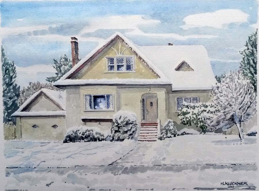
A commission (added to the Commissions page) from a snowy December in Vancouver.
... updated November 30, 2016
Reviews coming in for 2050 (click to see more) ...
...updated November 20, 2016
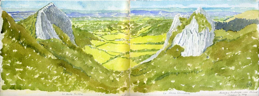
Watercolours, pencil drawings and snapshots from a recent trip through parts of southern France,
added to the long list of journeys indexed on my travel page.
...updated October 30, 2016
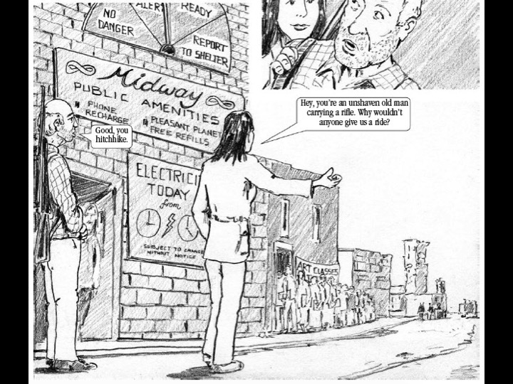
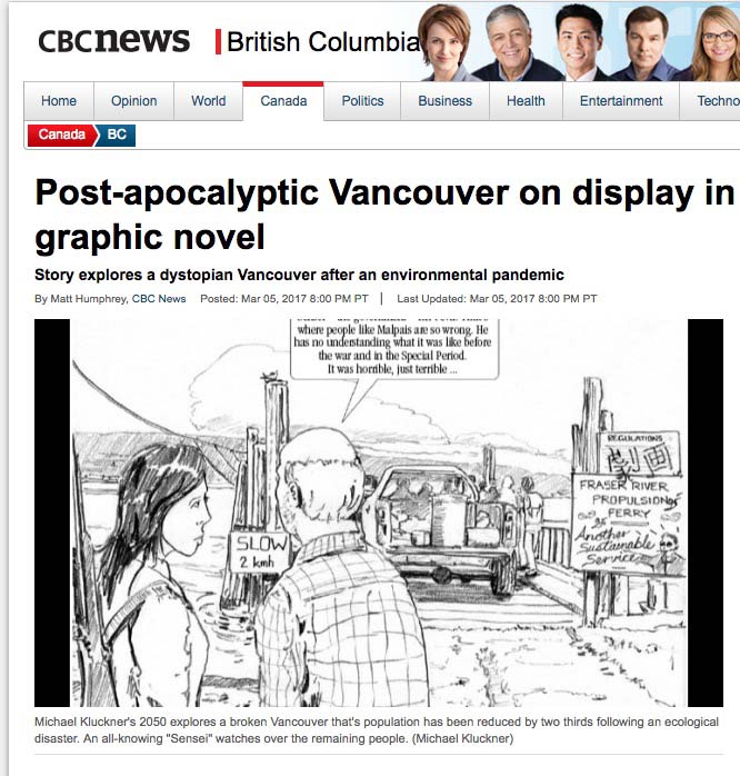
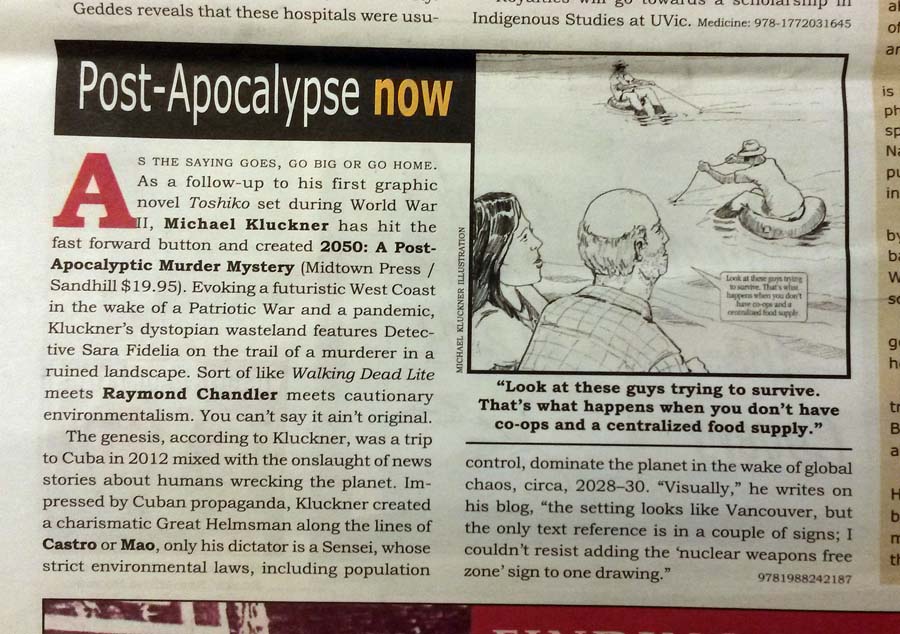
| 2050: A Post-Apocalyptic Murder Mystery, my new graphic
novel, will be launched on November 9th, 7 pm, at the Book
Warehouse at 4118 Main Street. Please come to the launch and
check out a preview of the book here. |
...updated October 24, 2016
Just back from a few weeks in France with sketches and watercolours needing to be finished...
...updated September 1, 2016
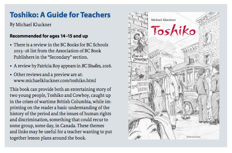
You can download a 4-page teachers' guide to Toshiko by clicking below...
...updated July 22, 2016
Summertime is commission-painting time: a couple of additions to that page.
...updated July 10, 2016
A piece avec moi on the CBC national program The Current about Vancouver and its housing woes.
...updated July 5, 2016
| Prompted by the talk I gave on Bowen last month, I've put the
images and text, more or less, onto this site here
as part of the ongoing Vanishing B.C.
project. And, on July 15th, I'll be moderating another of the SFU Philosophers' Café events, this time on graphic novels – are they for dummies or are they a real art/literary form? (Postscript: afterwards, as they ask you to do, I sent in the following to SFU, for their records, of a good discussion involving several librarians and a college instructor who attended: •all children's books are graphic novels. •graphic novels manage to tell both light and serious stories. •the most accessible graphic novels tell a story from a personal point of view, i.e. first-person narration. •a combination of cinematic artwork and text is very inviting for a reader; the best graphic novels tell part of the story visually, part of it textually •early graphic novel pioneers include Franz Masereel and Lynn Ward; other classics include Maus, Persepolis, and works by Joe Sacco. Chester Brown's Louis Riel tells a complex story with very spare, elegant artwork. •ESL speakers (or any second-language speakers in any culture) can get clues from the visual aspects of a graphic novel to bridge the gap in their comprehension of the language. •graphic novels, such as Shigeru Mizuki's Showa series, may be a way to open a door into a deep understanding of history, while providing good historical grounding themselves. •hybrids of "comics" pages followed by text are another way that the graphic novel format can tell stories.] |
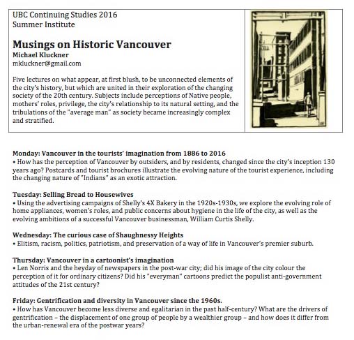
...updated June 16, 2016
| A few last-minute notices of events: June 17, "Whatever Happened to Free Time?" one of the SFU Philosophers' Café events, at the Oakridge Library at 7 pm.  June 19, I'll be talking and showing paintings from earlier days (at least my own earlier days) on Bowen at the AGM of the Bowen Island Historical Society, 2:30 pm. June 20 – 24, my course (a set of 5 lectures) called Musings on Historic Vancouver, part of the UBC Continuing Studies program. |
...updated May 11, 2016
We don't have a publication date yet for 2050, but it will be this year.
I'm at VanCAF at the Roundhouse Community Centre on May 21–22. It's free, drop by!
...updated April 1st (though not April Fool's Day), 2016
 |
What have I been doing lately? Working on a second
graphic novel, explaining my absence. I've added a few notes to the Vanishing BC sections, including pictures of the now-demolished Judge Haynes house in Osoyoos, some more correspondence and photos about North Bend, and a 2000 article about a reunion of people at Tranquille. Upcoming events include a couple of talks about Toshiko, teaching at UBC during the summer, teaching at SFU Harbour Centre in the fall, and a variety of other lectures, all to be added as the dates get closer. |
...updated February 13, 2016
 |
Art and a bit of writing from our recent trip to
Morocco, with time spent in Spain en route, added to the long
list of trips on my travel page. |
...updated February 8, 2016
| This is a good long podcast interview with Barry Link
about Toshiko. Click on the image above to go to it or find it
in the review section on the Toshiko
page. |
...updated January 12, 2016
| I don't normally flag additions to the Vanishing BC
pages, as there are too many of them, but the set of photos of
the Tranquille Sanatorium
is very good, as is the information from Tara Rose about Blakeburn,
including a pay sheet of her grandfather's from 1929 – wages
of $5.60 a day for a coal miner. |
Go to Earlier Newstuff
Contact me